Watercolor Wash Wall Murals for Calm, Subtle Color
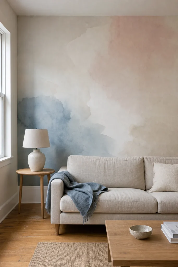
A room can need color without needing another pattern to manage. That is the appeal of a watercolor wash wall mural: it behaves more like atmosphere than ornament. The right design brings depth, movement, and a focal point while leaving the eye somewhere to rest.
The catch is that “soft” does not automatically mean calm. A pastel wall mural can still feel busy when it has hard-edged color changes, too many hues, a scale that fights the furniture, or obvious digital repetition. The most convincing rooms treat the mural as part of the architecture, then make every nearby choice support it.
Choose a wash with long, quiet color transitions
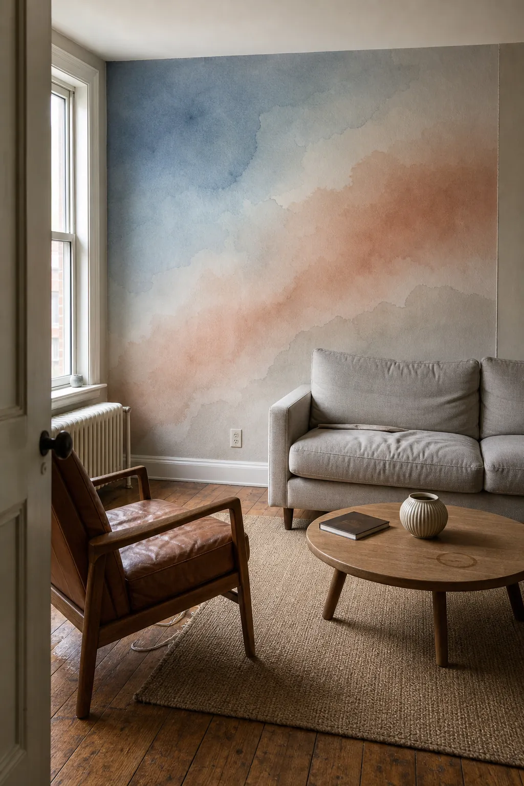

Start by looking at the distance between visible changes. A calm abstract watercolor mural lets one hue feather gradually into another across a large part of the wall. Designs packed with small blooms, splashes, outlines, or repeated clouds may use pale colors, yet they still create the same scanning pressure as a conventional pattern.
Step back from the sample—or shrink the product image on your screen—until details disappear. If the wall reads as two or three broad areas of value, it will usually sit quietly behind furniture. If it turns into many separate spots, it is likely to feel busier at full scale. Soft edges matter more than a soft color name.
Match the mural scale to the wall, not the sample
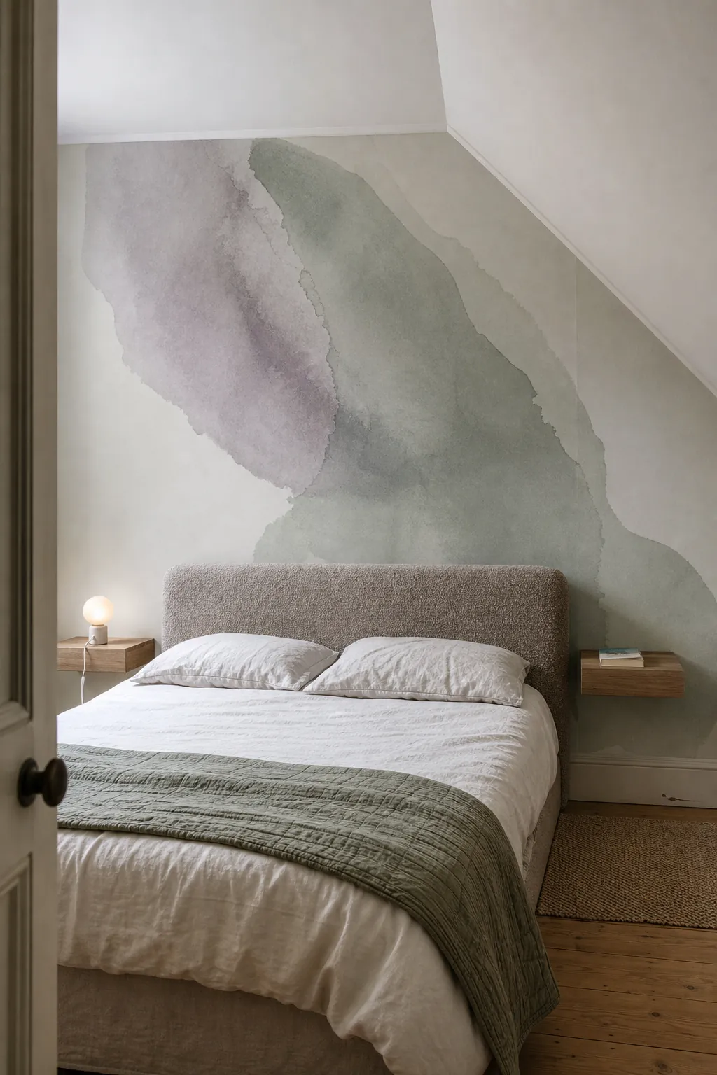

A mural is not simply oversized wallpaper. Its composition has a top, bottom, center, and visual direction, so the crop changes the result. Before ordering, map the manufacturer’s preview onto the exact width and height of your wall. Check where the strongest pigment will land after doors, wardrobes, a headboard, or a sofa cover part of the image.
For a wide wall, broad horizontal washes tend to feel settled. On a tall, narrow wall, a gentle vertical lift can emphasize height without creating a stripe. Avoid enlarging a small raster design beyond its intended dimensions; fuzzy texture can look like a printing fault rather than intentional painterly softness. Ask for a proof that shows the final crop, not only a styled room mockup.
Pull one grounded paint color from the palest area
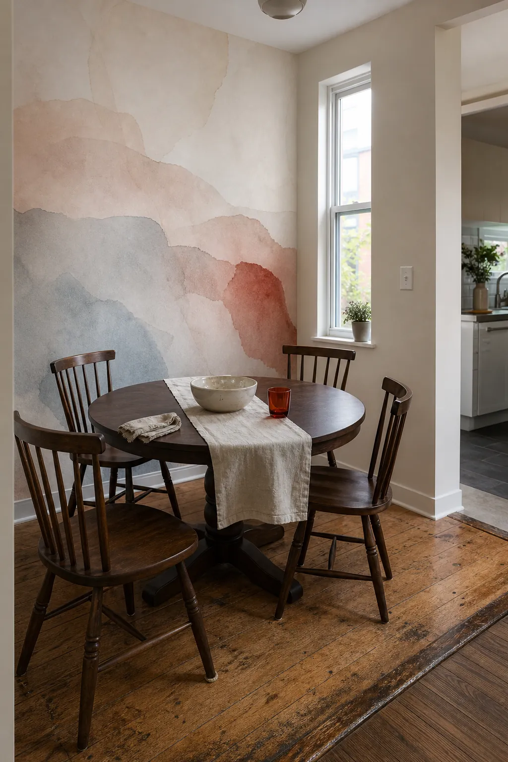

The quickest way to make a single mural wall look intentional is to connect it to the rest of the room. Choose an adjacent-wall paint from the mural’s palest background rather than its most memorable accent. A warm chalk white, misty gray, pale putty, or diluted blue-green can let the mural’s edge dissolve instead of stopping abruptly.
Then repeat the darker watercolor note only once or twice—in a cushion seam, ceramic lamp, bed throw, or slim chair frame. That restraint matters. If every accessory matches every mural color, the room becomes themed. A good color bridge is visible after you notice it, not before.
Let furniture interrupt the wash naturally
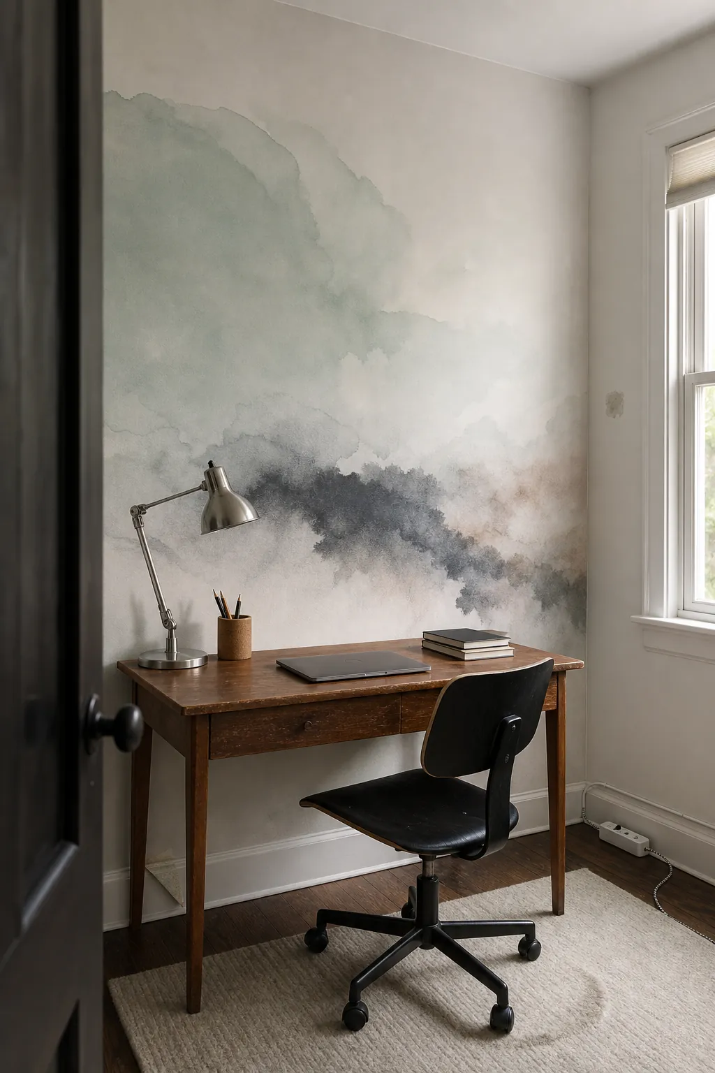

You do not need to keep the mural wall bare. In fact, a low headboard, credenza, desk, or sofa often gives an atmospheric wash the physical anchor it needs. Favor furniture with a simple outline, then let the strongest color remain visible above or beside it. The mural should still make sense when part of it is hidden; that is another reason to avoid designs built around one tiny central motif.
Be sparing with objects mounted directly on the surface. One mirror or a pair of compact sconces can work, but a gallery wall competes with the very breathing room you chose the mural to create. If storage is essential, closed cabinetry reads more calmly than shelves filled with small objects.
Use texture to stop pastel color from feeling sugary
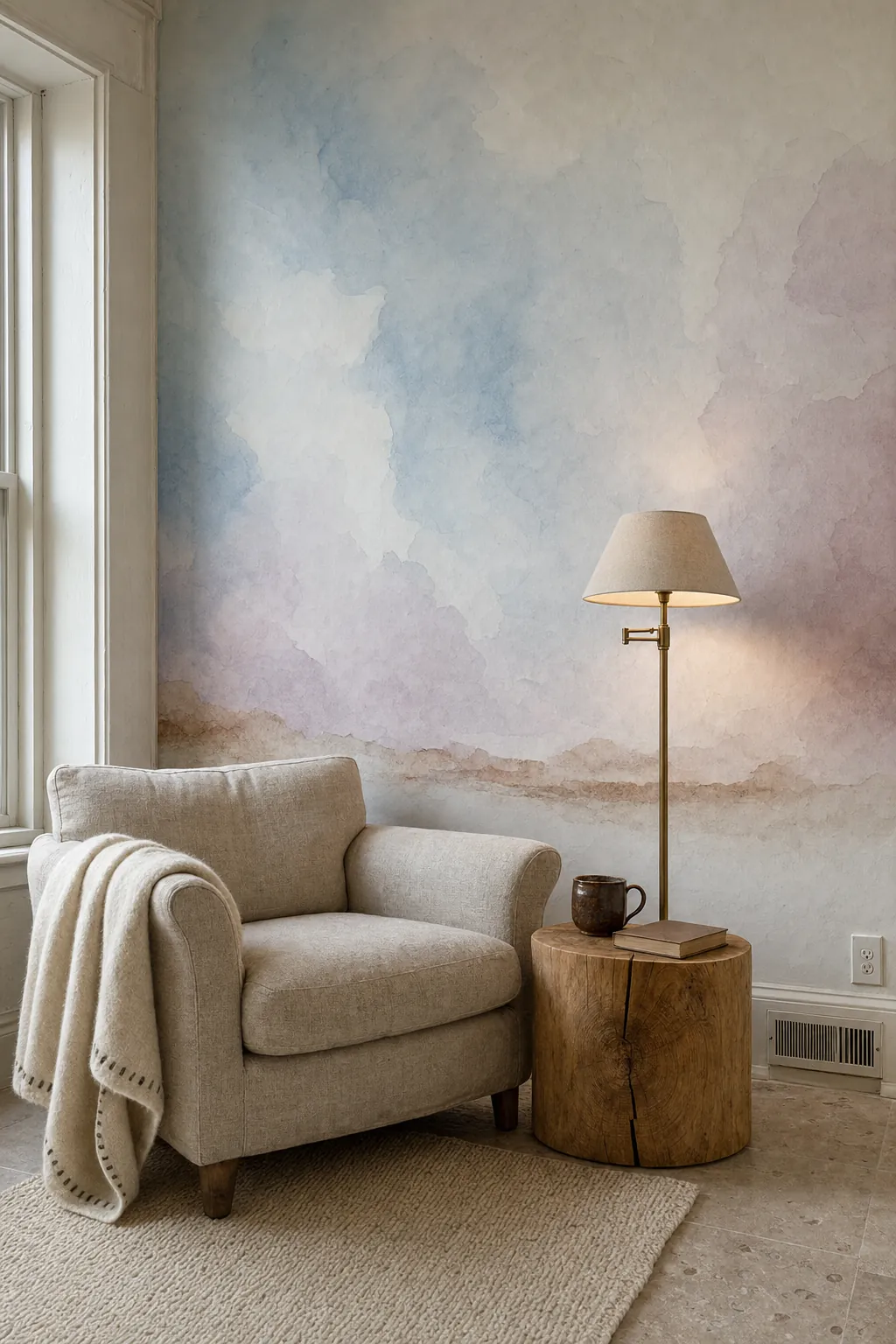

Pastel washes become more livable when the room includes materials with visible grain and weight. Washed linen, unfinished or matte-sealed oak, wool, aged brass, woven cane, and slightly irregular ceramics keep pale pink, lilac, or blue from drifting into nursery territory. The contrast is tactile rather than graphic, so it adds richness without adding pattern.
Choose two dominant textures and one smaller accent. A linen sofa plus oak table may only need a ceramic lamp; adding boucle, rattan, marble, velvet, and several metals at once works against the mural’s quiet premise. Under warm artificial light, test whether the paper shifts yellow or muddy. View the sample in morning, afternoon, and evening conditions before committing.
Make seams and wall preparation part of the design decision
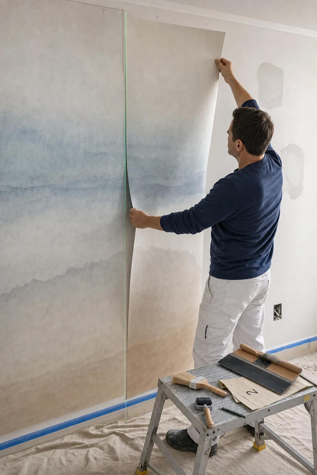

A watercolor mural wallpaper exposes surface problems differently from a busy print. Broad pale areas can reveal bumps, old adhesive, patched holes, or dark marks underneath, while a gradient crossing two panels makes poor alignment obvious. Fill and sand defects, clean the wall, apply the primer recommended for the substrate, and allow it to cure fully.
Lay the numbered panels out before pasting. Confirm the image direction, trim allowance, and whether the product calls for butt joints or overlap-and-trim installation. Draw a true plumb line for the first panel rather than trusting a corner. On high walls, stairwells, or expensive custom crops, professional installation is often cheaper than replacing a damaged set.

Order for the room you live in, not the room in the preview
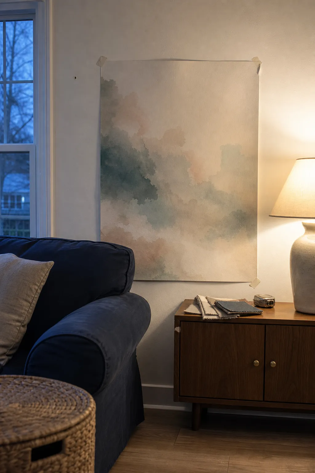
Styled previews are useful for mood, but they cannot show your wall texture, window direction, ceiling height, or the amount of visual clutter that daily life adds. Tape the largest sample available to the actual wall and leave it there for several days. View it from the doorway, from your usual seat, and with the lights you use at night.
Choose a material that fits the household as carefully as the artwork fits the room. Renters may prioritize a removable system and test it in an inconspicuous spot. Busy homes need a surface that tolerates gentle wiping. Bathrooms require explicit manufacturer approval for humidity and adequate ventilation. Always verify paste, primer, cleaning, and removal instructions for the exact product rather than assuming every mural behaves alike.
The best soft watercolor wallpaper mural does not ask you to admire every brush mark. It changes how the room feels from across the space: quieter, more dimensional, and gently colored. If the sample still gives you that effect after the novelty wears off, you have probably found a wash you can live with.