Vintage Seascape Mural Wallpaper Ideas for Cottage Interiors
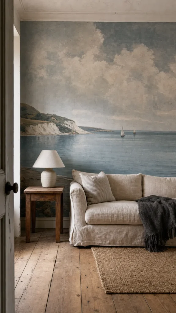
A vintage seascape mural can make a cottage or lake house feel as though it has always belonged near the water. It can also tip a room into themed-rental territory in a single afternoon. The difference is rarely the amount of blue. It is whether the mural is treated as the room’s one scenic statement or merely the largest item in a pile of nautical references.
The strongest rooms let an old-world beach mural establish the view, then build around it with quiet architecture, honest materials, and furniture that looks collected rather than coordinated. That approach answers the concern homeowners raise again and again: how do you capture the romance of the coast without seashell clutter, novelty signs, or a room that feels too busy?
Choose a Seascape That Matches the Water Outside
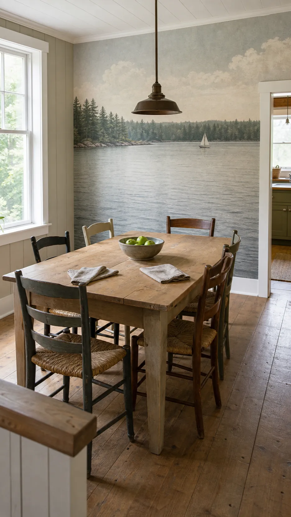
Begin with geography, not a color swatch. An Atlantic cottage can carry a saltier, more dramatic image: broken clouds, chalky cliffs, slate water, or an antique harbor. A lake house usually feels more convincing with a sheltered shoreline, distant tree line, small sailboat, or softly rippled water. The scene does not need to reproduce the actual view. It should share its pace, light, and horizon.
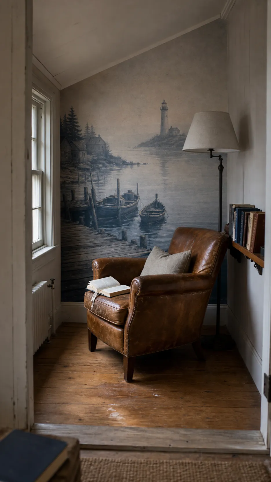
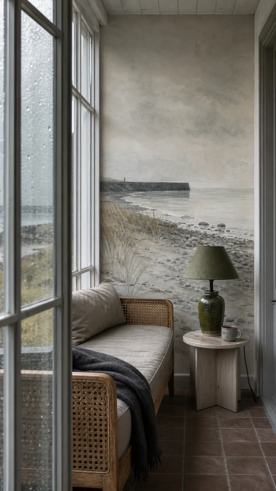
Look closely at the mural’s implied weather. High-contrast foam and storm clouds create movement; mist, faded ink, and a low-contrast horizon create rest. A reading corner generally benefits from the latter, while a broad living room with simple upholstery can absorb more drama. For a convincing vintage seascape mural wallpaper, favor softened pigments and visible print character over a hyper-sharp photographic ocean.

Let the Mural Carry the Coastal Story
If the wall already shows water, boats, and sky, the room does not also need anchor cushions, rope lamps, shell bowls, and oars. This is the simplest way to avoid a kitschy coastal interior: repeat materials and colors, not motifs. Pull the gray-green of distant water into linen upholstery. Echo a sandy shoreline with a rush seat or pale oak table. Repeat the dark line of a pier with aged bronze hardware.
Natural materials do more work than themed accessories. Washed linen, wool, cane, oak, soapstone, pottery, and old glass all belong comfortably beside a classic coastal mural because they share its tactile age. Keep decorative objects useful: a ceramic lamp, a basket for blankets, a stack of books, a weathered stool. The effect reads as a real cottage that happens to face the water, not a set assembled to prove it.

Control Scale Before You Commit
A mural is not a repeating pattern. Cropping changes the whole composition. Before ordering, tape the wall dimensions onto a screenshot or use the supplier’s preview tool. Check where the horizon, largest boat, brightest cloud, and darkest mass will land. A horizon cutting directly through the top of a headboard can feel awkward; one floating above it gives the furniture breathing room.
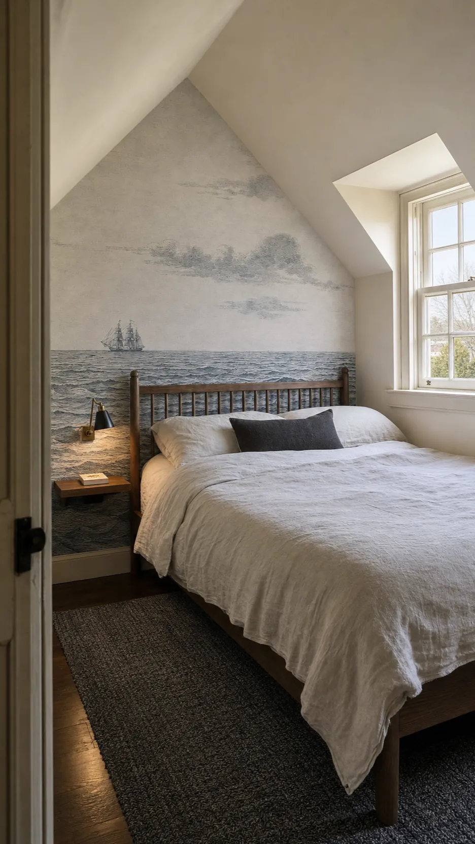
Small rooms do not automatically require a tiny scene. In fact, one broad, low-contrast landscape can make a compact bedroom feel deeper because the eye travels beyond the wall. The real danger is not size but visual fragmentation. Choose fewer large forms, generous sky or water, and a focal point that remains visible after furniture is placed. Photograph the empty wall and roughly mark every tall object before approving the crop.

Use Architecture to Frame the View
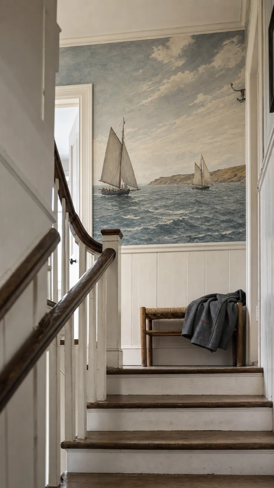
The most believable mural walls work with the building. Picture rails, beadboard, simple crown molding, shallow beams, and old trim can make printed scenery feel integrated rather than pasted on. In a cottage with imperfect plaster, a mural above painted wainscoting is particularly useful: the lower wall takes daily knocks while the seascape stays visually protected.
Do not force symmetry when doors, windows, or a sloped ceiling make it unnatural. Treat those interruptions like the edge of a painting. A stair landing can hold a narrow slice of shore; a dormer wall can frame mostly sky; a dining alcove can show the quiet middle of a lake. What matters is that the scene has an intentional focal path from the room’s usual entrance.

Build a Palette from the Faded Notes
Matching every blue is the fastest route to a flat room. Instead, identify three quieter notes inside the artwork: perhaps warm paper, storm gray, and a trace of moss. Give each a different job. The paper tone might become the wall and curtain color, gray might anchor upholstery, and moss might appear once in a glazed lamp or wool throw.
For cottage seascape wallpaper, aged neutrals are more useful than bright white. Chalk, oatmeal, mushroom, flax, and pale putty soften the boundary between printed image and room. Dark accents should be sparing but deliberate: a blackened iron sconce, smoked oak frame, or deep brown side table can connect the darkest marks in the mural to the foreground. This gives the room depth without making it nautical.

Balance Romance with Ordinary Daily Life
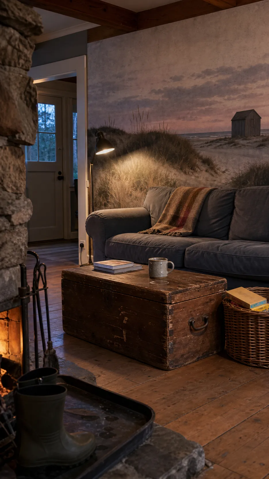
A room becomes convincing when it shows how people actually use it. Leave room for a reading light, charging cable, wet boots, board games, and a washable rug. In a family lake house, performance fabric and a sturdy coffee table matter more than perfectly styled accessories. In a seasonal cottage, breathable curtains and furniture that tolerates humidity matter more than delicate antiques.
This practicality also keeps an old world beach mural from feeling theatrical. Pair its romance with one or two plainspoken pieces: a deep slipcovered sofa, a scrubbed pine bench, a simple iron bed, or an unfussy dining table. Allow modest wear, irregular pottery, and books that are actually read. The mural supplies imagination; the furniture should supply comfort.

Plan the Installation as Carefully as the Styling
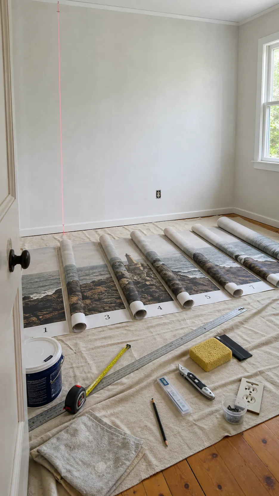
Even the best image loses its spell when a seam wanders through the horizon or a wall bump catches side light. Measure the wall at its widest and highest points, follow the supplier’s allowance guidance, and confirm the final crop before production. Lay numbered panels in order and inspect the full image before paste touches the wall.
The wall should be clean, smooth, dry, and even in color. Fill holes, sand ridges, remove loose paint, and prime porous or strongly contrasting surfaces as the mural maker directs. Establish the first panel with a true vertical line rather than trusting an old corner. Large panels are easier with two people, and a fresh blade prevents ragged trimming. Material-specific instructions always outrank generic advice, especially for peel-and-stick versus paste-the-wall products.

A traditional beach wallpaper succeeds when you stop decorating around the word “beach.” Choose scenery with the right emotional weather, crop it around real furniture, borrow its faded secondary colors, and let useful natural materials complete the room. Then the wall does not announce a theme. It creates the quiet sensation that the water has always been just beyond the house.