How to Match Dining Chairs and Lighting to a Scenic Mural
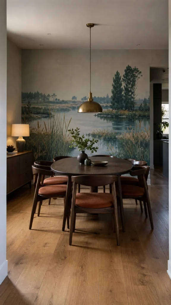
A scenic mural already gives a dining room color, movement, depth, and a point of view. Chairs and lighting should not repeat all four. Their job is to make the wall feel connected to a room where people can sit comfortably, see their food, and enjoy one another after sunset.
The easiest mistake is literal matching: green forest mural, green chairs, leaf-shaped chandelier. That produces a theme rather than a layered room. A more durable approach is to match undertones, visual weight, and mood while varying the actual materials and shapes.
Read the mural as a palette, not a paint chip
Identify the mural’s background tone, two secondary colors, its darkest value, and any small accent. The background may guide the surrounding paint. A secondary tone is usually the safest upholstery choice. The darkest value can appear in chair frames or metal finishes, while the accent is best reserved for small, changeable details.
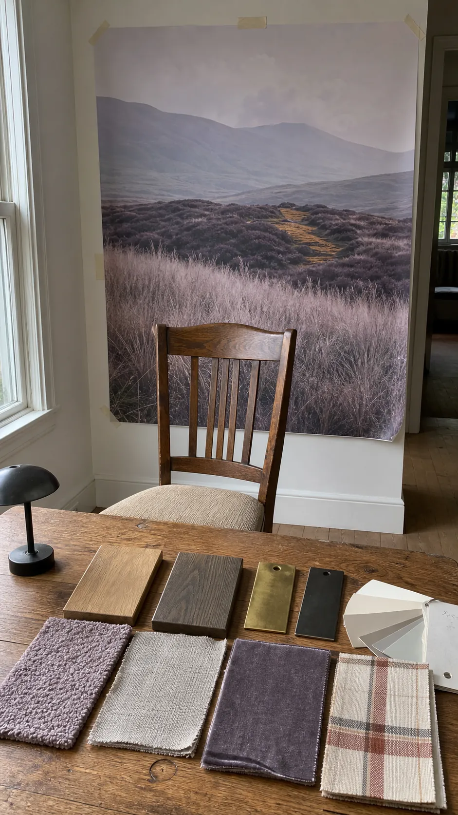
Do not rely on a screen. Place a physical mural sample beside chair fabric, wood, and metal finishes in the dining room. Check them in clear daylight, dull daylight, and the light you use for dinner. Printed greens, blues, and grays can shift dramatically under warm lamps.

Match chair silhouette to the mural’s visual density
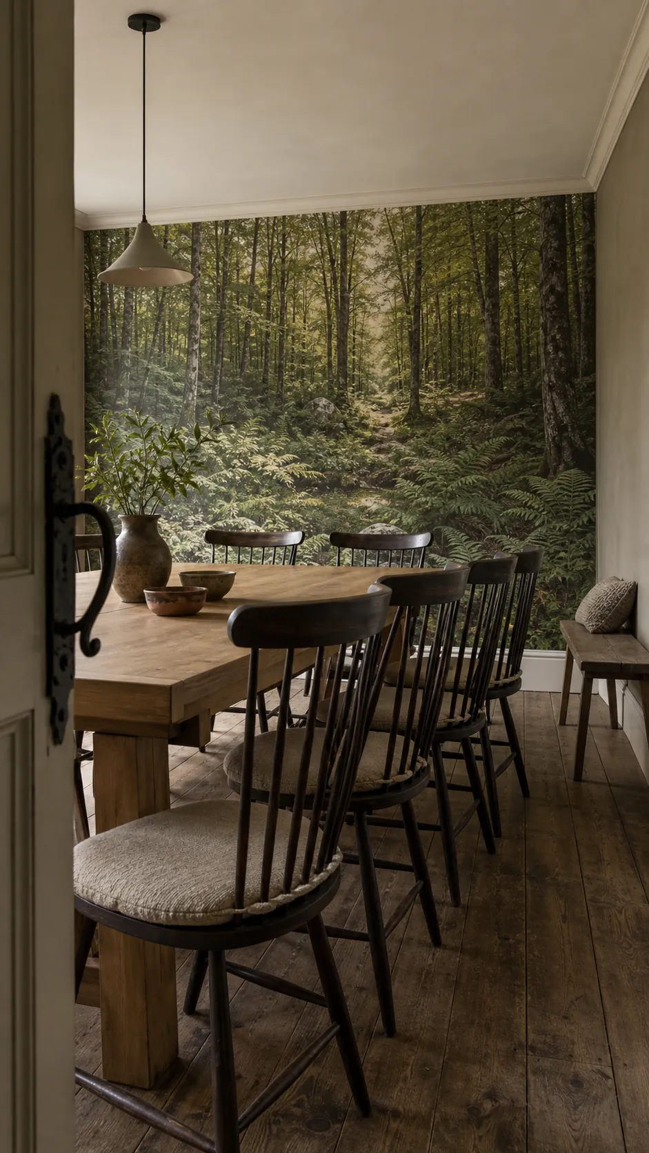
A detailed scenic wallpaper benefits from chairs with open backs, narrow rails, or a simple curved outline. They let the lower landscape remain legible and create pauses between the mural and table. A pale, misty, low-contrast scene can support a more substantial upholstered chair because the wall supplies less visual weight.
Comfort still comes first. Check seat depth, back angle, and pullout clearance before choosing a delicate shape only because it photographs well. If the table is visually heavy, chairs need enough presence to balance it even when the mural is intricate.

Choose contrast instead of exact color matching
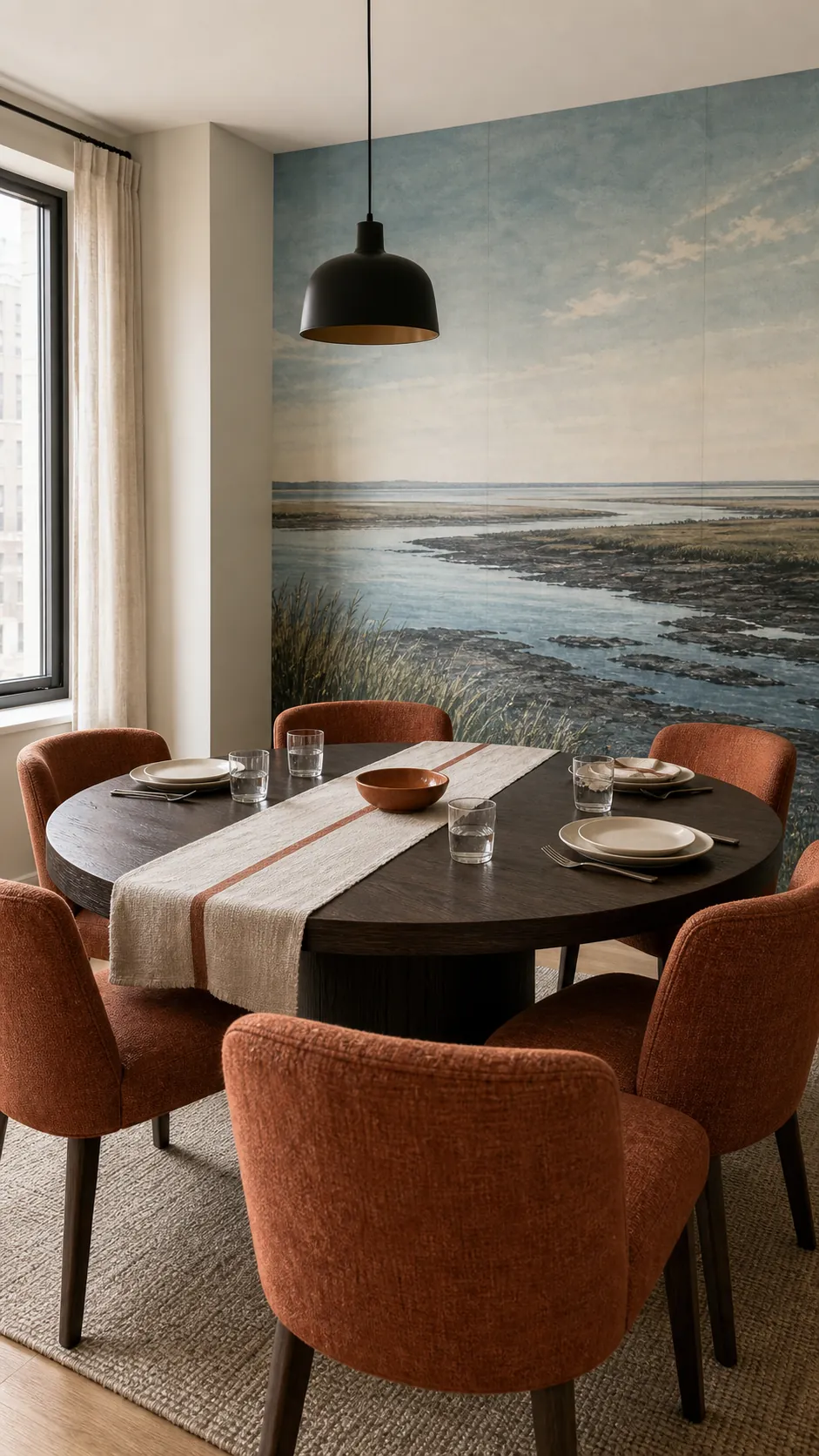
If chairs match a dominant mural color exactly, their edges can disappear. Use controlled contrast: warm rust upholstery against blue-green scenery, dark timber against a pale atmospheric mural, or natural cane against deep woodland tones. The difference helps the furniture remain readable without fighting the wall.
Repeat the chair color once or twice elsewhere, but not everywhere. A runner, ceramic bowl, or curtain edge is enough. Cohesion comes from a few relationships, not from making every object the same shade.

Let the pendant anchor the table
The main pendant belongs to the table first. Its size should relate to the tabletop, its height should preserve views across dinner, and its shape should not cover the mural’s key focal point from the doorway. A long table may suit a linear fixture or a small rhythm of pendants; a round table usually works with one centered form.
When the mural is already detailed, a fixture with a clear simple silhouette is often stronger than an ornate one. Material can create the connection instead: aged brass can echo warm grasses, blackened metal can pick up dark tree trunks, and a linen shade can soften a pale painterly scene.
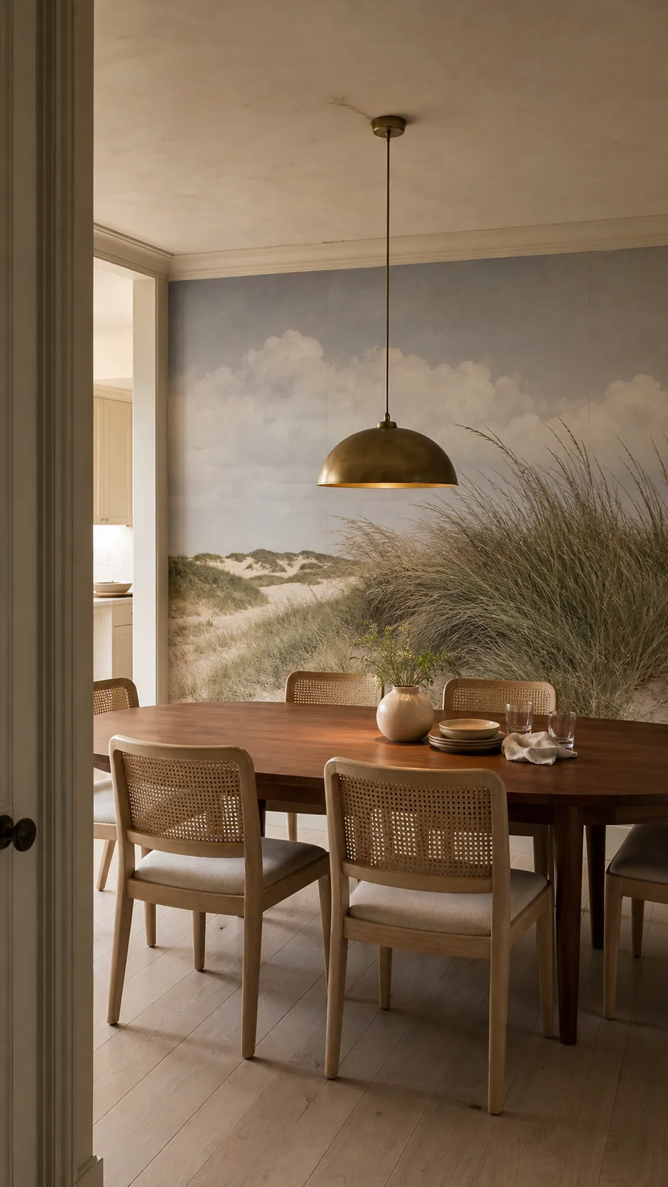

Layer light instead of flooding the mural
One bright ceiling fixture creates glare on tableware and leaves the mural flat or shadowed. Use a dimmable pendant for the table, then add a quieter second layer: shaded sconces on adjacent walls, a sideboard lamp, or carefully aimed ceiling lights that graze the paper rather than producing hot circles.
Warm-white evening light is flattering, but very warm lamps can turn neutral paper yellow and muddy blue-green ink. Compare bulb samples against the installed mural. Matte paper is more forgiving than glossy material, especially when diners face the wall directly.
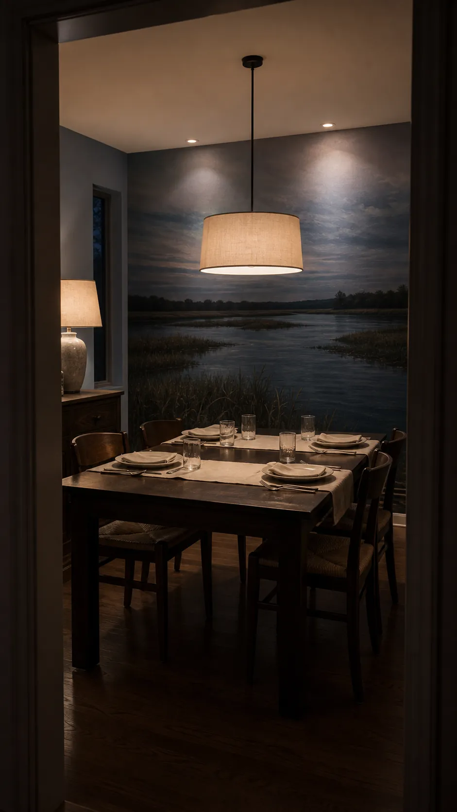

Test the complete combination at dinner time
Build a temporary test before ordering every chair or hardwiring a fixture. Tape a large mural sample to the wall, place one chair against it, and set up a portable lamp at roughly the proposed color temperature and height. Add your actual tableware and view the combination from the doorway and each seat.
Look for three problems: chair color that shifts unpleasantly after dark, a fixture that blocks the mural’s focal area, and reflections that appear at seated eye level. Fixing any of these in a test costs little. Fixing them after installation can mean new upholstery, electrical work, or a mural you never enjoy at night.
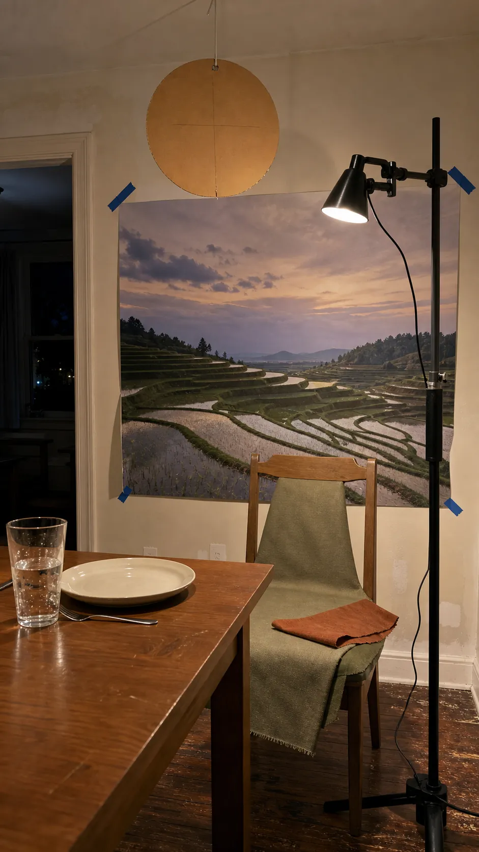

Aim for agreement, not imitation
The strongest dining room mural styling lets each element keep its identity. The mural creates atmosphere, chairs provide comfort and rhythm, and lighting gives the table focus after dark. They need a shared undertone and compatible visual weight, not identical colors or literal motifs.
Start with the physical mural sample, choose chairs that remain distinct against it, and light the table separately from the wall. When those three decisions are tested together in the actual room, the result feels composed rather than matched—and stays flexible when fabrics, bulbs, or table settings change.