How to Choose a Panoramic Landscape Wallpaper Mural for Room Depth
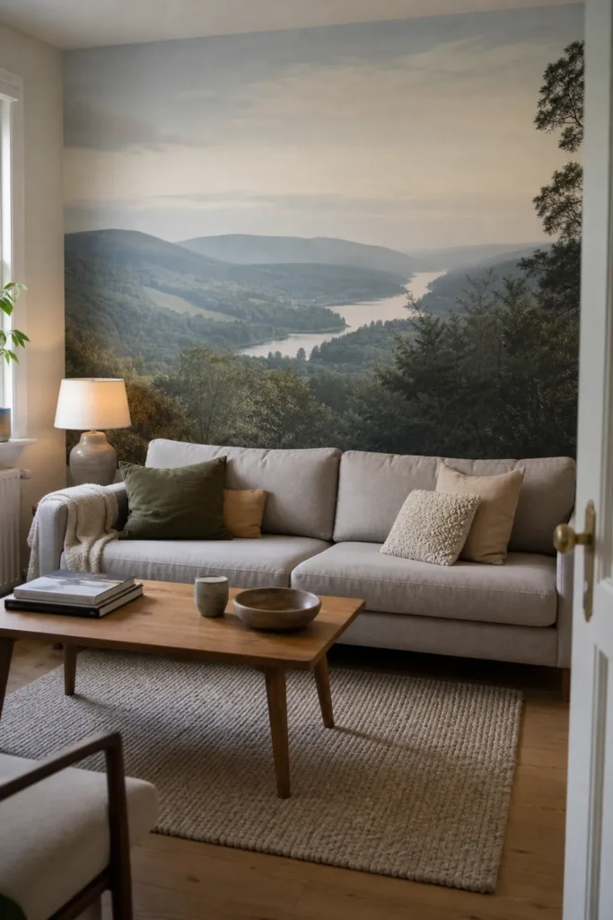
A panoramic landscape wallpaper mural can make a room feel deeper, but only when the image behaves like a believable view. The best choice is not always the most dramatic mountain range or the most saturated sunset. It is the mural that gives your eye somewhere to travel, fits the wall without awkward cropping, and leaves enough visual space for the furniture you already live with.
If you are choosing a panoramic landscape wallpaper mural for a small living room, dining nook, office, or bedroom, think less about decoration and more about spatial perception. A strong scenic wallpaper mural can act like a quiet window. A poor one can feel like a poster pressed too close to your face.
A panoramic mural should extend the room, not fight it
The depth effect comes from three things working together: a clear horizon, layered distance, and a calm transition from the real room into the printed scene. When those pieces line up, the wall feels less like a flat boundary and more like a long view.
This is why a large landscape wallpaper can work beautifully in compact rooms. Reddit home-decor threads often show the same split reaction: people worry a mural will be too bold, then change their mind when the mural fits the room’s sightline and gives the space a stronger focal point. The lesson is not that every small room needs a huge scene. The lesson is that scale feels intentional when the mural has a job.
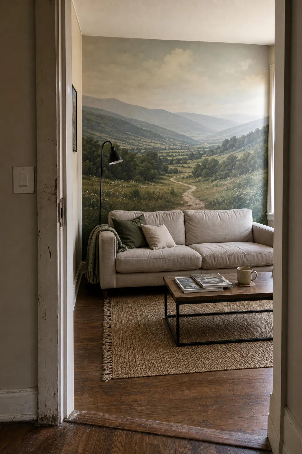

Start with the first view from the doorway
Before choosing a mural, stand where you first see the room: the doorway, hallway, stair landing, or the open-plan path from the kitchen. That first view decides whether the mural feels like depth or just a busy feature wall.
For a wall mural that makes a room look bigger, the strongest wall is usually the one you see straight on or at a gentle angle. If the mural is hidden behind a sofa, chopped up by tall bookcases, or squeezed onto a wall full of outlets and doors, the depth illusion weakens. The eye needs a clean route into the landscape.
- Best wall: the wall that reads as the natural end point of the room.
- Risky wall: a side wall that forces you to view the scene from a sharp angle.
- Hardest wall: a wall broken by doors, windows, vents, switches, or tall storage.
Choose a horizon that sits at a human height
The horizon line matters because it quietly tells your brain where the view begins. If the horizon is too high, the room can feel bottom-heavy and compressed. If it is too low, the mural may feel like you are looking down from an odd balcony. For most rooms, the easiest panoramic wall mural to live with has a horizon or distant focal band somewhere around seated or standing eye level.
In a living room, test the view from the sofa. In a dining room, test it from the table. In a bedroom, test it from the doorway and from the bed. If the key part of the landscape disappears behind a headboard, sideboard, or television, choose a mural with the important depth cues higher or farther to the sides.

Pick layered distance over a flat pretty scene
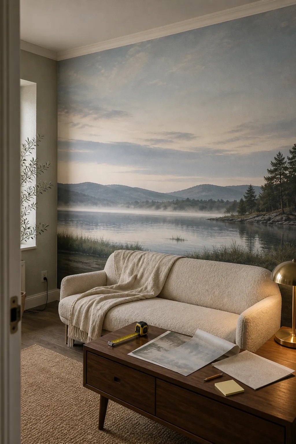
A mural can be beautiful and still do very little for depth. The scenes that visually stretch a room usually have foreground, middle ground, and background. Think of a shoreline with reeds close to the viewer, water in the middle, and mountains in the distance. Or a forest path where nearby trunks frame a softer opening beyond.
Flat scenes are harder. A wall of trees shot straight on may feel restful, but it can also read as a printed screen. A mountain range with no foreground may look like a poster. A large sky with no landform can feel empty. For landscape wall mural ideas that create room depth, look for overlap, recession, atmospheric haze, diagonal paths, shorelines, valleys, bridges, meadow edges, or waterlines that pull the eye inward.
- Good depth cue: a path, river, pier, tree line, ridge, or shoreline receding into the distance.
- Good room cue: open space near the center where furniture will not cover the main view.
- Good softness cue: distant haze or muted background detail so the mural does not shout.

Use scale, but avoid visual shouting
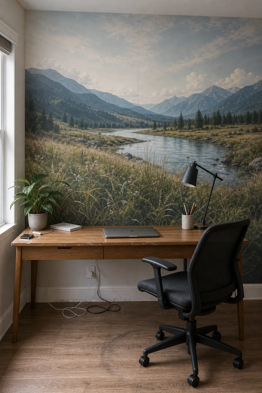
Small rooms do not automatically need tiny prints. In fact, tiny repeating patterns can make a room feel busier because the eye keeps counting the repeat. A mural has the opposite advantage: one large view can simplify the wall. The trick is choosing large scale with calm detail.
If your room already has patterned upholstery, open shelving, colorful art, or a lot of visible everyday items, choose a scenic wallpaper mural with fewer high-contrast details. Misty valleys, soft coasts, quiet forests, and distant hills tend to be easier than hyper-detailed villages, crowded tropical leaves, or sharp black-and-white mountain ridges.
For a mural wallpaper for small living room walls, check the largest object in the mural against your largest furniture piece. If a printed tree trunk is wider than your sofa arm, or a mountain peak lands exactly behind a lamp, the scene can feel awkward. Better murals leave the furniture looking anchored, not miniature.
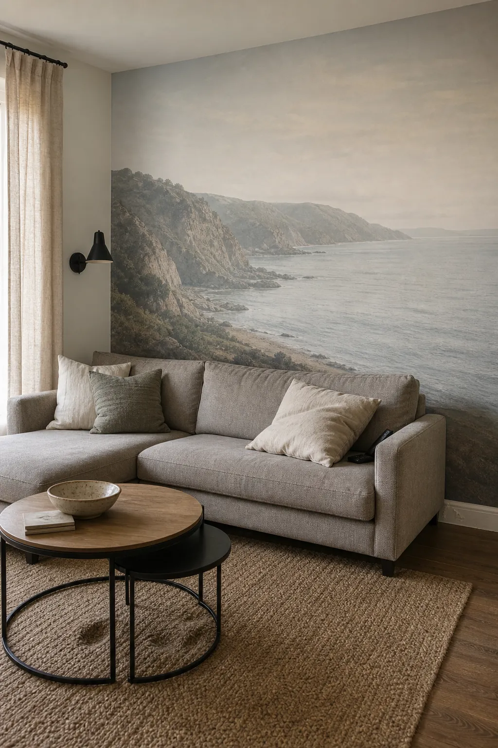

Match the mural color to the room’s real light
Color can either open the wall or make it feel heavier. Bright daylight rooms can handle deeper greens, stormy blues, and richer landscape shadows. Windowless or north-facing rooms usually need a mural with softer contrast and more air in the palette. That does not mean everything has to be pale. It means the mural should have breathing room between dark and light areas.
Bring the mural sample into the room at morning, afternoon, and evening. Warm bulbs can make beige cliffs, dry grasses, and sunset scenes look more yellow than expected. Cool bulbs can make blue mountains feel colder. If the goal is room depth, the safest palettes are often muted green-gray, blue-gray, soft sage, warm stone, faded olive, cloud white, and natural wood tones repeated in the furniture.
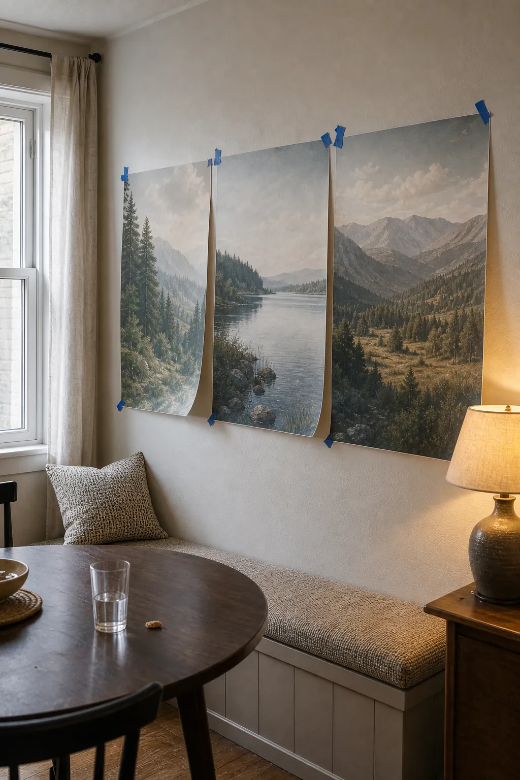

Measure the full wall, then protect the important part of the view
Custom mural ordering is not just about width and height. You are also deciding what gets trimmed, what lands behind furniture, and where the seams fall. Measure the wall at the widest and tallest points, then note baseboards, crown molding, sloped ceilings, outlets, vents, radiators, switches, and anything that cannot move.
Many mural guides recommend adding a small margin to the wall measurements so installation is safer and final trimming is cleaner. That margin is useful, but it also means you should preview the crop. Do not let the best part of the lake, valley, path, or horizon sit at the outer edge where it could be trimmed away.
- Ask for a proof or crop preview if the mural is custom-sized.
- Keep faces, animals, cabins, boats, and strong focal points away from seams when possible.
- Check panel order before installing so the panoramic view flows correctly across the wall.
- Prep the surface first: clean, dry, smooth walls make seams and edges less noticeable.
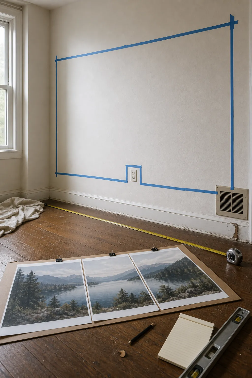

Style the room so the mural can breathe
The mural does not have to carry the room alone. It needs furniture, textiles, and lighting that support the view instead of competing with it. Low furniture is especially helpful because it leaves the horizon open. A low sofa, slim console, simple bed frame, or clean-lined dining bench lets the mural stay readable.
Repeat two or three colors from the mural elsewhere in the room. If the landscape has blue-gray water and warm stone, bring in a blue-gray cushion and a warm wood tray. If it has soft green hills, repeat that green once in a throw, lamp base, or plant. This small repetition makes the panoramic landscape wallpaper mural feel built into the room rather than pasted onto it.
Then edit around it. Avoid hanging small framed art on top of a scenic mural unless the mural is intentionally subtle. Avoid placing tall shelves over the most distant part of the scene. If you need storage, keep it to the sides or choose lower pieces that do not cut the view in half.
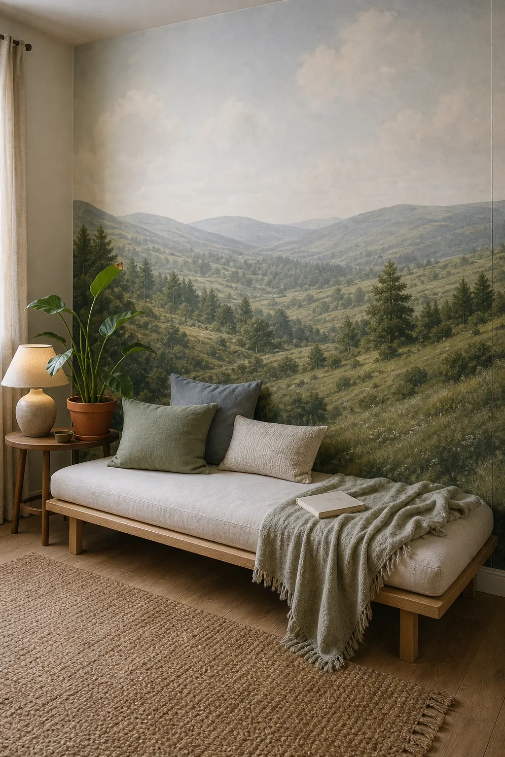

Quick checklist before you order
- The main wall is visible from the room’s natural entry point.
- The mural has a clear horizon or distant focal area.
- The scene includes layered distance, not just a flat pretty background.
- The important part of the view will not be hidden by furniture.
- The palette works in the room’s actual morning, afternoon, and evening light.
- The crop preview protects the main landscape details from trimming and seams.
- The furniture plan leaves enough blank visual space for the mural to feel like a view.
The best mural is the one that changes how the room feels
A panoramic mural is worth choosing when it solves a room problem. It can make a short wall feel longer, give a windowless corner an outdoor feeling, calm a busy room with one large view, or turn an awkward blank wall into the reason the room works.
Do not choose only the prettiest landscape. Choose the one that gives your eye a path, keeps the horizon believable, respects your furniture height, and survives the practical details of measuring and installation. That is when a room depth wall mural stops being a risky accent and starts feeling like architecture.