Blush Pink Wallpaper Nursery: A Calm, Grounded Design Guide
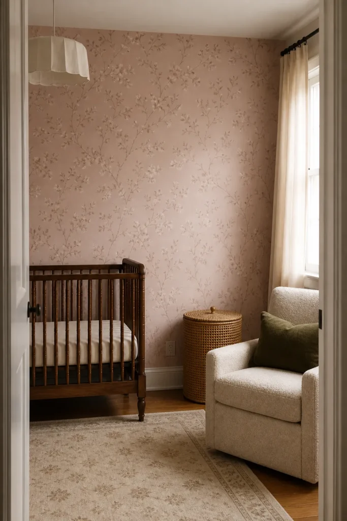
A blush pink wallpaper nursery can feel serene, vintage, modern, or washed out—the difference is rarely the word “blush.” It is the undertone, contrast, pattern rhythm, and materials around it. Choose the paper in the room’s real light, then add enough depth that pale pink does not disappear.
Find the blush undertone your light supports
Blush can lean peach, beige, mauve, coral, or grey. A north-facing room may make greyed pink feel dull; strong warm afternoon light can push peach blush toward orange. Tape a large sample on each candidate wall and check it morning, afternoon, and night.
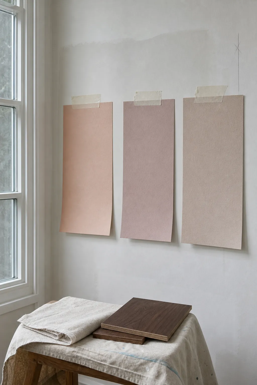

Bring the crib finish and curtain fabric beside the sample. A warm white that looks neutral alone can appear yellow next to pale pink nursery wallpaper, while a cool white may make the room feel sharper than intended.
Use subtle pattern to create depth
Subtle pink wallpaper does not have to mean a flat solid. Fine stripes, grasscloth texture, scattered stems, faded block prints, and tonal geometrics catch light and keep a pale room interesting. The quieter the contrast, the more suitable the print is for several walls.
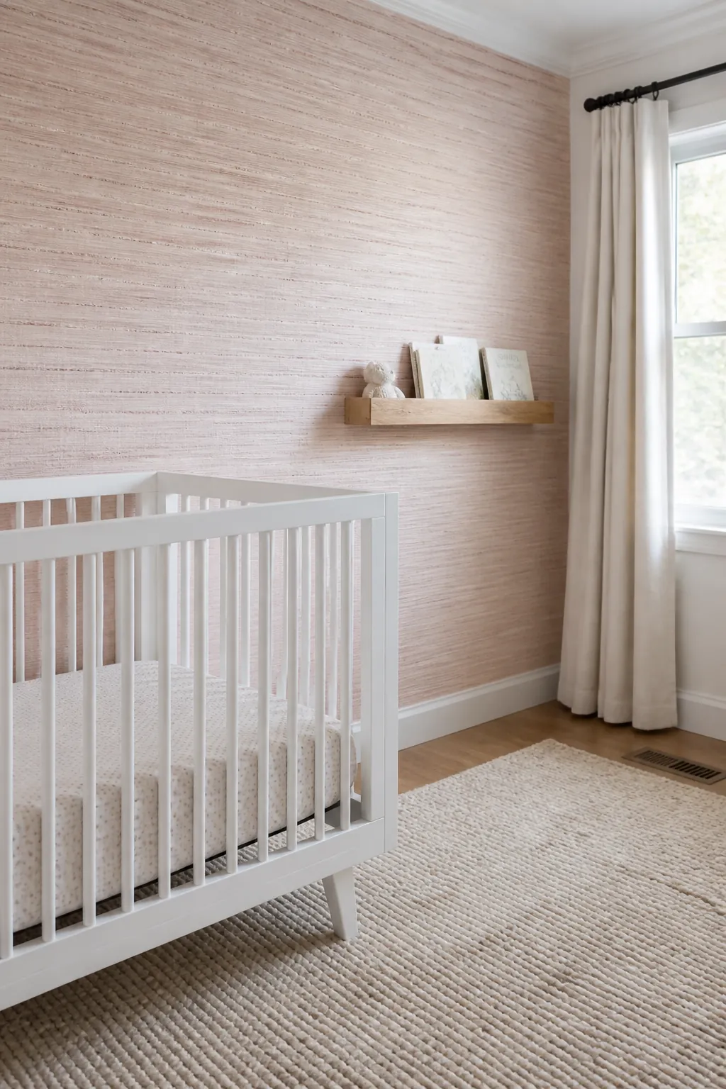

For one focal wall, a larger dusty pink wallpaper motif can create more presence. Always compare the pattern repeat with wall width and furniture height; a sample that shows only one flower does not reveal the installed rhythm.
Ground pale pink with natural contrast
A pale room becomes flat when the wallpaper, rug, curtains, and furniture all share the same value. Ground blush with walnut, medium oak, olive, burgundy, aged brass, warm cream, or mushroom. A pink nursery rug can work, but choose a deeper or more textural pink than the wall.
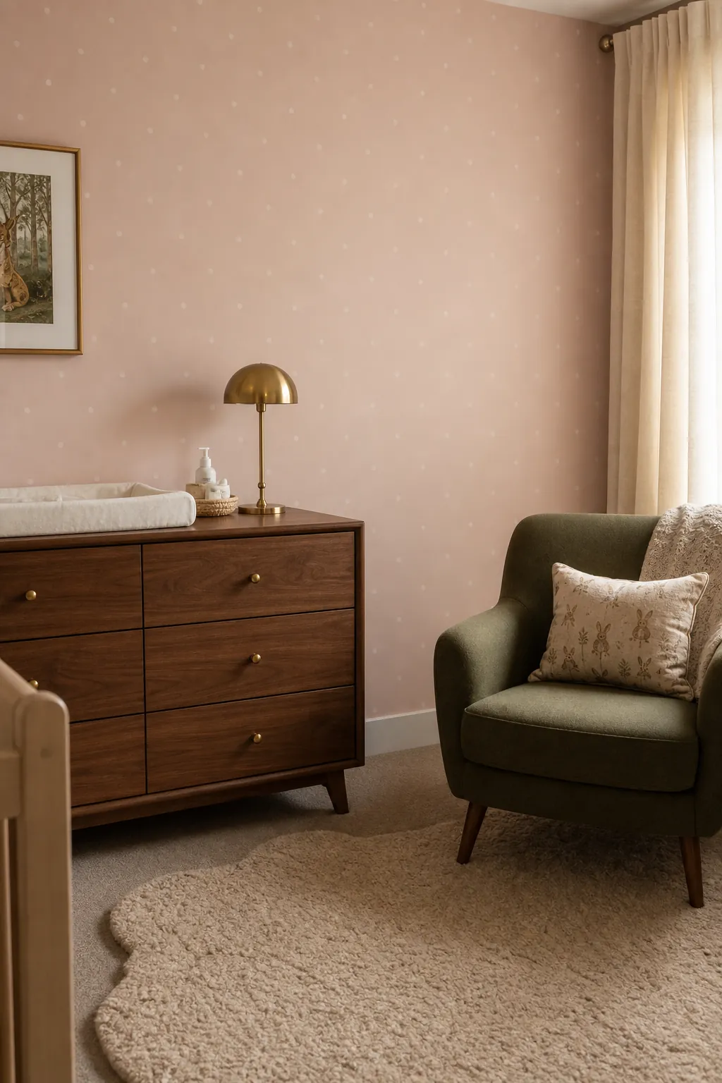

Contrast does not make a nursery less calm; uncontrolled repetition does. One dark wood piece and a few olive or burgundy notes can make the blush read softer without filling the room with accessories.
Create a vintage pink nursery without a costume
Vintage style works best through material and silhouette: a spindle crib, pleated shade, cane mirror, turned timber detail, or faded floral. Avoid assembling every nostalgic cue at once. Pair an old-world pink floral nursery print with simpler contemporary storage and lighting.
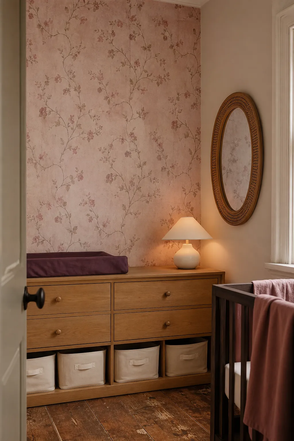

If the wallpaper contains birds or animals, inspect their expressions, scale, and nighttime visibility. A charming detail to an adult may feel intense at child height. Airier motifs and gentle repetition tend to age more gracefully.
Choose the right amount of wallpaper
A blush pink accent wall provides a clear focal point when the motif is large or high contrast. Tonal paper can wrap the room and behave almost like textured paint. Mark out the boundary, view it from the doorway, and consider where it will end if the crib or dresser moves later.
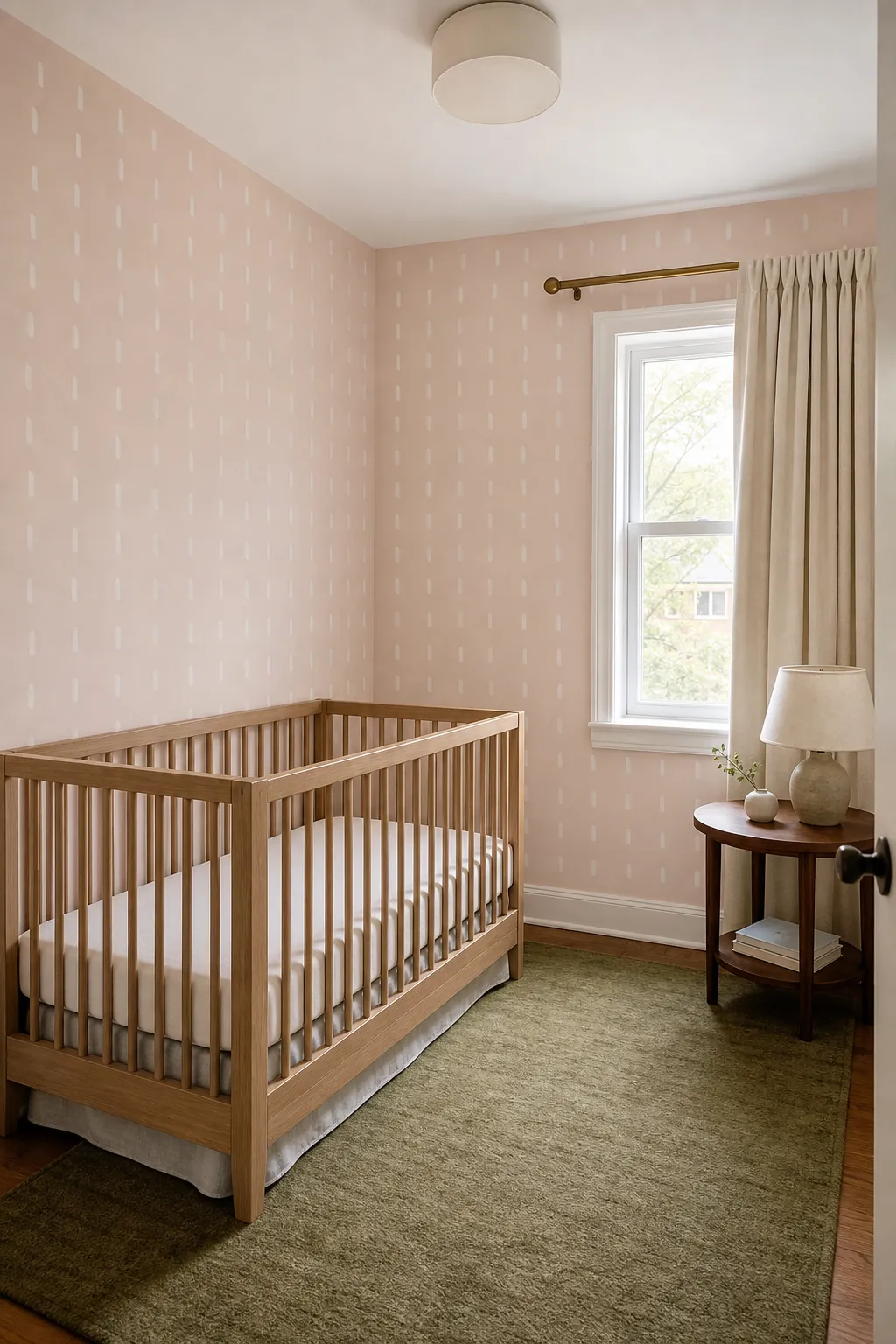

In a small room, papering all walls can feel cohesive when the background is light and the repeat is open. Use solid curtains and a simple rug so the wallpaper remains the only continuous pattern.
Test the surface and install for longevity
Samples solve material questions as well as color questions. Test peel-and-stick paper on the exact painted surface for several days, especially on texture. For pasted paper, prepare the wall as specified and check repeat, panel sequence, and overage before cutting.
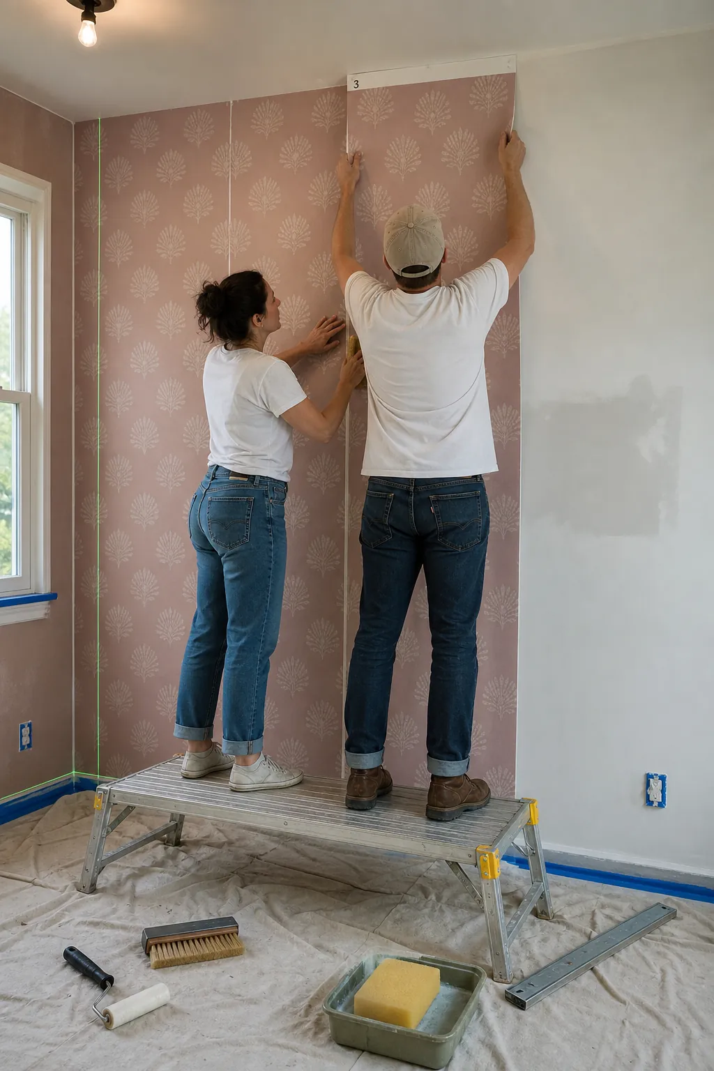

Choose a product with clear material and emissions information, follow ventilation guidance, and keep loose edges away from the sleep area. The right blush wallpaper should look good in imperfect daylight, work with furniture already owned, and still feel welcoming after the reveal is over.