Light Pink Wallpaper Nursery: A Calm, Practical Design Guide
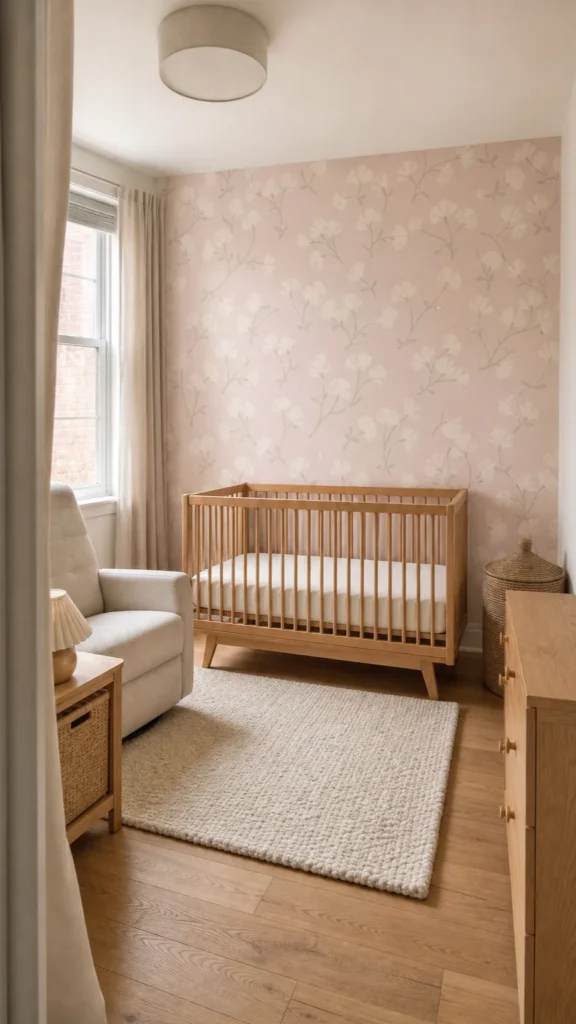
A light pink wallpaper nursery can feel calm, modern, and genuinely useful at 3 a.m.—but only when the pink, pattern scale, and surrounding finishes are chosen as one system. The common mistake is buying a pretty sample in isolation, then discovering that it turns peach under warm bulbs, looks busy behind the cot, or fights with the rug. The better approach is to begin with the room’s light and daily routines, then choose a wallpaper that supports them.
This guide focuses on the decisions that matter after the inspiration-board stage: where to place the paper, how to test a very light pink wallpaper, what makes a floral feel restful rather than fussy, and how to build a pink nursery aesthetic that can grow beyond the baby years.
Start With the Pink’s Undertone, Not Its Name
“Blush,” “pale pink,” and “light baby pink” are marketing names, not reliable color specifications. One sample may lean dusty and gray; another may contain enough orange to read as peach. Place large samples on two walls and observe them in morning daylight, afternoon shade, and under the exact lamp used for feeds or bedtime. The right pink should remain quiet in the room’s least flattering light.
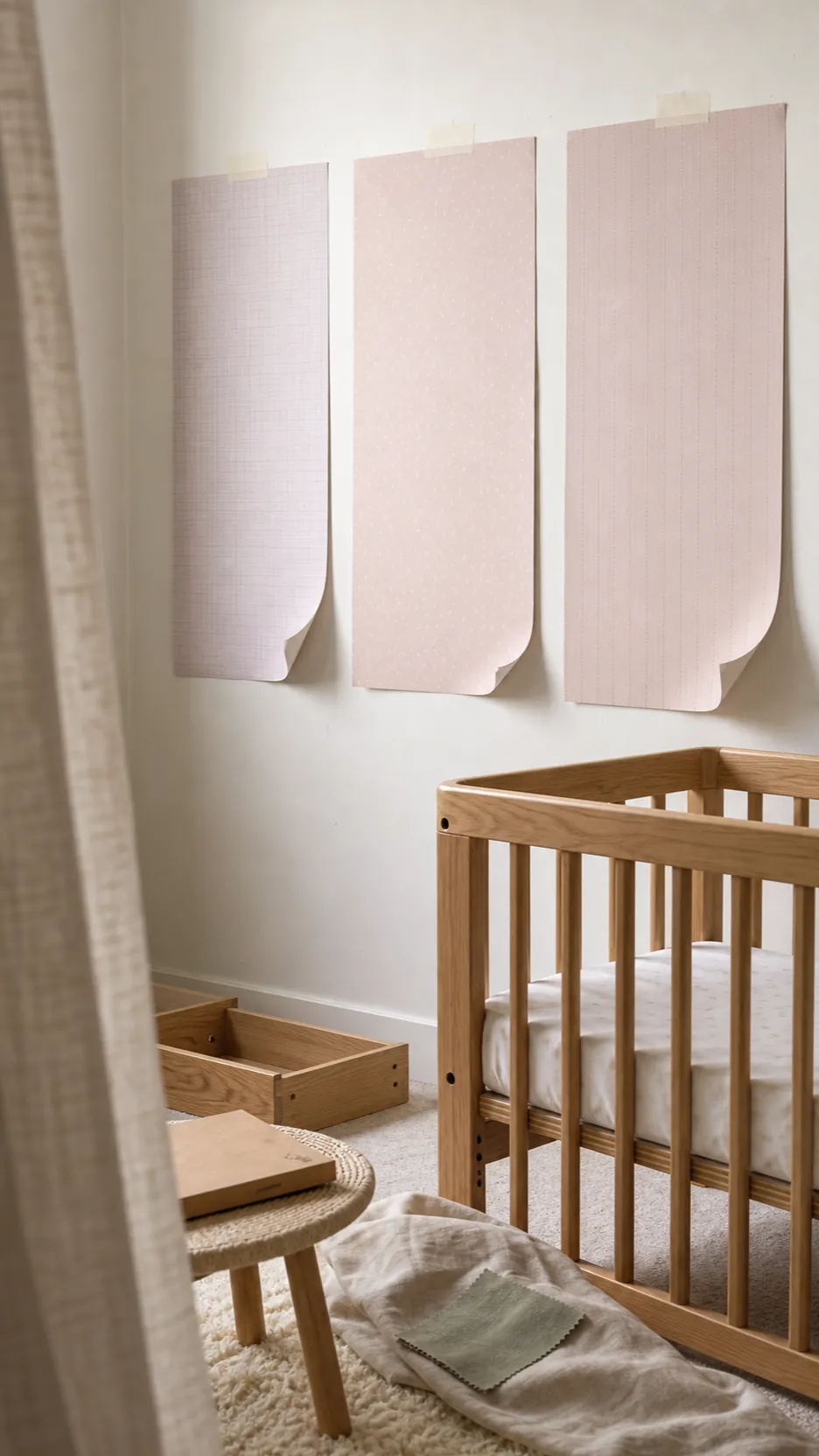

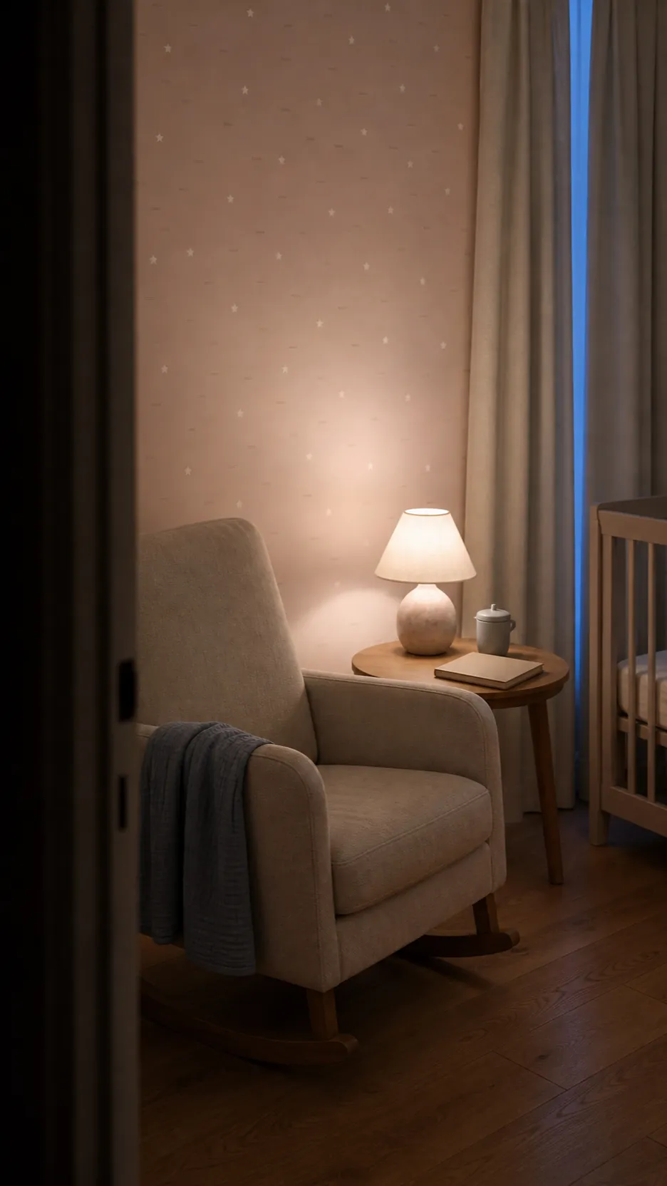
Cool northern light can make a blue-based pink look slightly lilac, while strong sun intensifies saturation. Warm LEDs can push a creamy blush toward salmon. If you want a subtle pink wallpaper that behaves like a neutral, look for a muted base with a little gray or beige. Pair it with warm white rather than brilliant white, then repeat the undertone once in a small textile instead of matching every object.

Choose One Calm Focal Wall
A pink accent wall nursery is often the most forgiving solution for a small room or a limited budget. It gives the space identity while leaving three quieter walls to reflect light. The wall behind the cot is the classic choice, but it is not automatically the best one. Consider which wall is visible from the doorway, where seams will fall around windows, and whether the pattern will be hidden by a tall dresser.
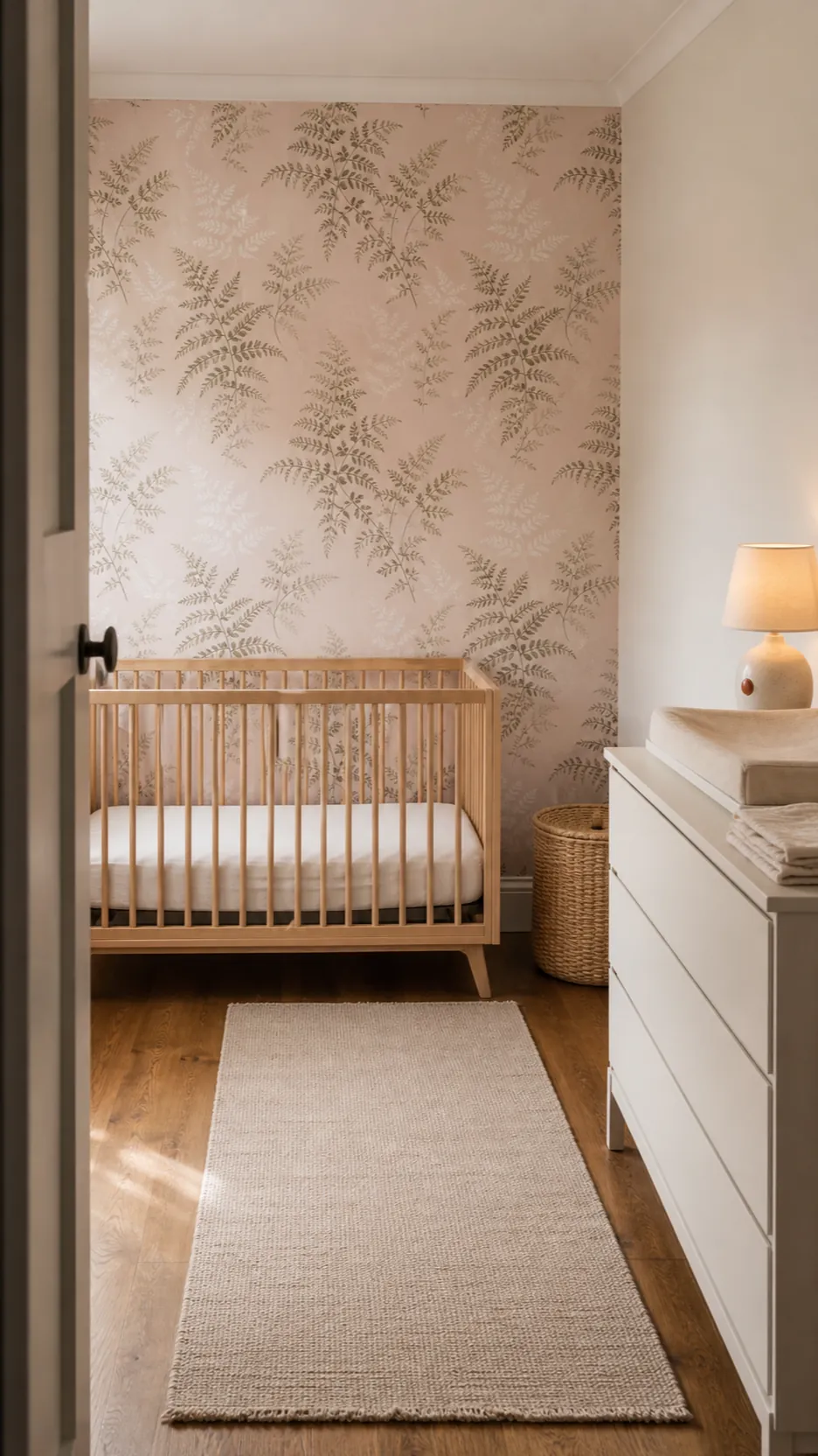

Keep the cot itself clear of loose décor, cords, shelves, and heavy objects. Wallpaper is the visual feature; it does not need a second layer of frames above the sleep space. If the pattern is dense, paint adjacent walls in the lightest background color found in the paper. That move makes the feature wall feel integrated rather than pasted onto an unrelated room.
Match Pattern Scale to Viewing Distance
Pattern scale changes how restful a nursery feels. Tiny, high-contrast motifs can merge into visual noise from across the room, especially when used on every wall. A larger, open repeat gives each shape room to breathe and can make a compact nursery feel less cluttered. For a floral wallpaper nursery, look beyond the online close-up: print or order a sample large enough to show at least one complete repeat.
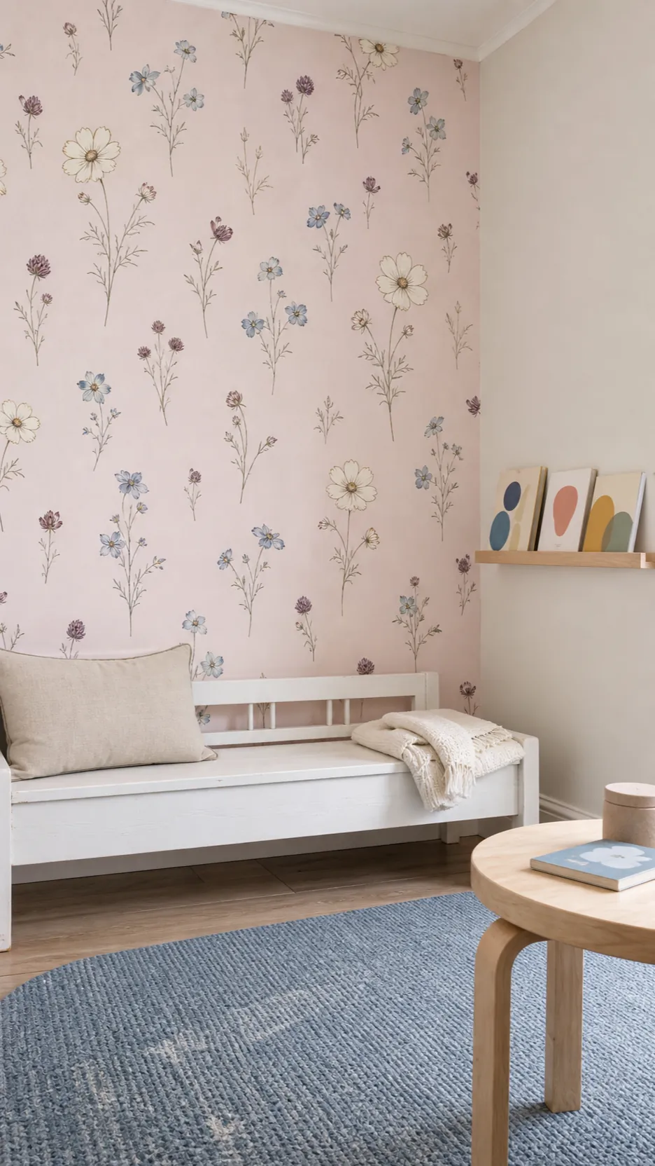

Stand where you will usually enter and view the sample at that distance. The motif should remain legible without demanding attention. Low-contrast stems, scattered buds, gingham, or a loose watercolor-like repeat can deliver personality without turning the wall into a busy backdrop. If the rug, curtains, or cot sheet already carry a pattern, let the wallpaper be the only dominant print.
Build the Palette With Texture Instead of More Pink
A successful pink nursery aesthetic rarely comes from matching the wallpaper to a pink nursery rug, pink curtains, pink storage baskets, and pink bedding. That much repetition flattens the room. Treat pale pink wallpaper as the warm color layer, then add contrast through materials: pale oak, woven cane, oatmeal linen, cream wool, matte ceramic, and a small amount of muted sage or clay.
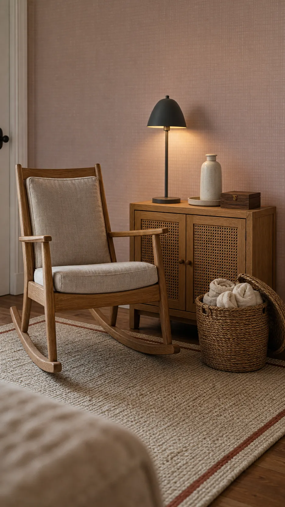

Texture creates depth without making the room louder. A flatweave rug is easier to vacuum than a deep shag, and washable cotton curtains are more practical than a delicate fabric that cannot handle sticky hands. Choose one dark grounding note—perhaps walnut drawer pulls or a charcoal lamp base—so the pale scheme does not disappear into a sugary haze.
Select the Right Material for Your Walls and Timeline
Peel-and-stick is attractive to renters and fast-moving families, but “removable” does not guarantee damage-free removal. Results depend on the paint, wall texture, primer, humidity, and how long the material stays installed. Test a sample in an inconspicuous spot and leave it for the manufacturer’s recommended period. Newly painted walls also need their full cure time before covering.
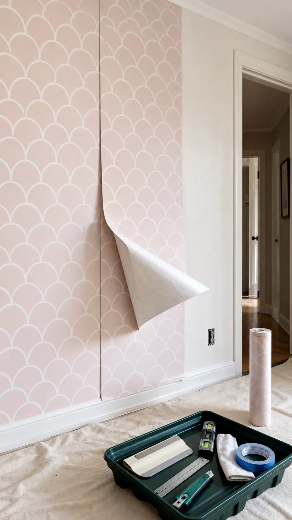

Traditional paste-the-wall paper can be easier to reposition during installation and may give a more durable finish on a properly prepared wall. Whatever the method, order from one batch when possible, calculate for pattern matching, and keep an extra roll for repairs. For a baby’s room, ask the manufacturer for material and emissions information, favor low-emission products, ventilate during installation, and allow adhesives or fresh paint to cure before the room is occupied.
Design for the Toddler Room That Comes Next
The most useful modern pink wallpaper does not need obvious baby icons. An abstract scallop, spare botanical, fine stripe, block print, or softly textured grasscloth effect can work with a cot now and a small bed later. A pattern that grows with the child reduces both waste and the pressure to redecorate on a schedule.
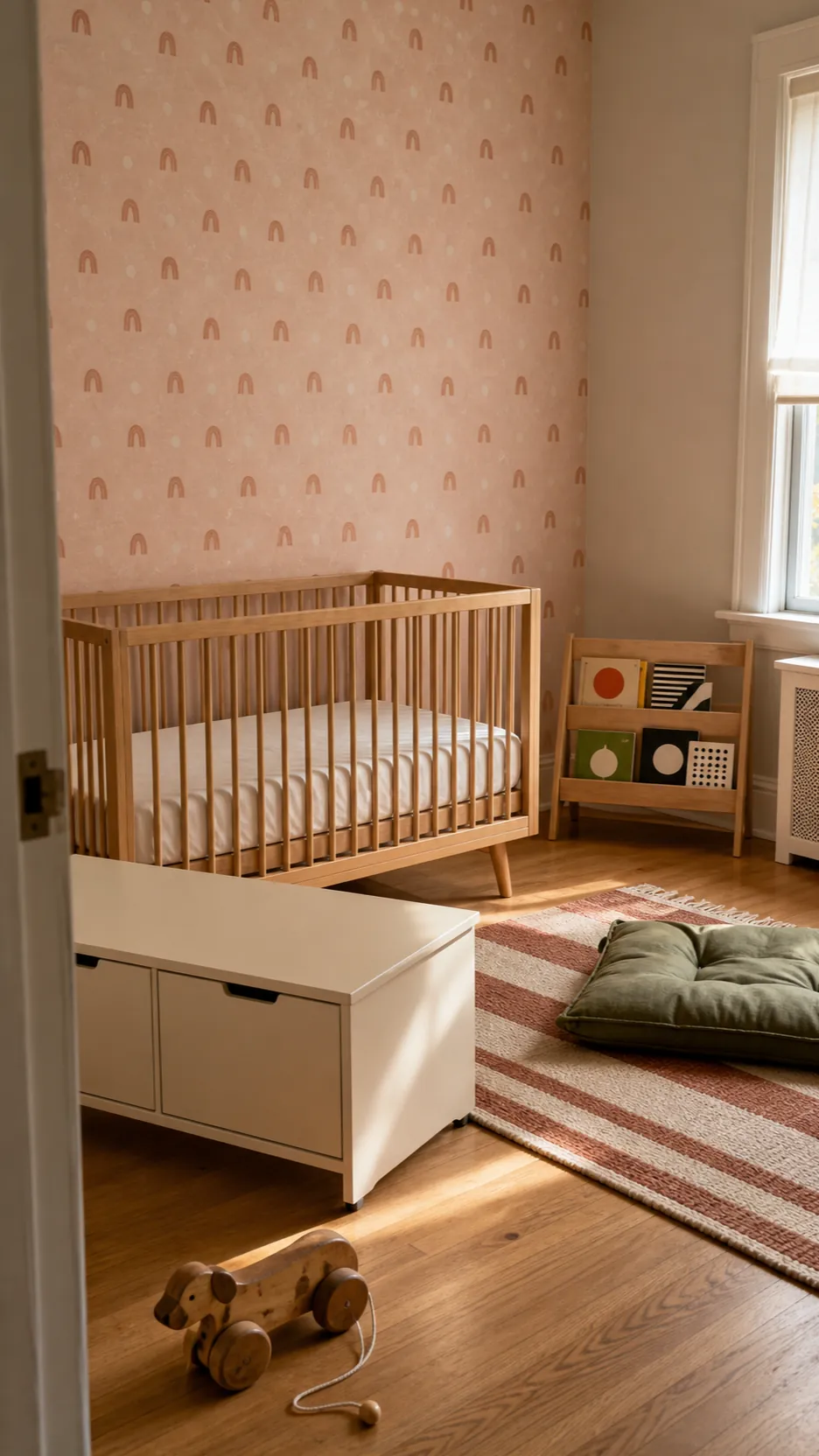

Before ordering, imagine the paper with a toddler bed, open book storage, and toys in stronger colors. If the wallpaper still provides a calm background, it has staying power. Keep the expensive pieces neutral and let smaller, washable items carry changing interests. The best light pink wallpaper nursery is not the one with the most coordinated accessories; it is the one that still feels composed when real family life arrives.