Neutral Abstract Wallpaper Murals for Pattern-Shy Homes
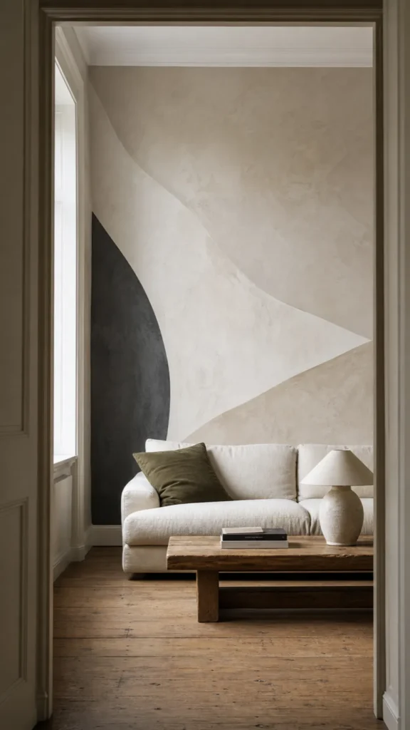
People who say they are afraid of bold pattern are usually afraid of the wrong things: a room that feels busy from every angle, a costly choice they cannot undo, or a wall that suddenly dictates every cushion and curtain. A neutral abstract wallpaper mural avoids those problems not by disappearing, but by controlling where contrast and movement happen.
The best quiet statement wall still has structure. It may use cream, taupe, stone, clay, and charcoal, yet give the eye a clear path through scale, texture, and shape. Neutral is a color decision; calm is a composition decision. You need both.
Judge Contrast Before You Judge Color
A beige abstract mural can be louder than a blue one if it jumps from near-white to dark espresso in sharp blocks. Before thinking about hue, squint at the design or view it in grayscale. If the darkest and lightest areas still snap apart, the mural will read strongly across a room. If the values sit closer together, it will behave more like shifting plaster or soft light.
For a first mural, aim for a low-to-medium value range with one controlled darker area. That anchor keeps a soft neutral mural from looking washed out, while the surrounding quiet tones prevent it from dominating. Place the darkest mass away from a television, fireplace, or large dark cabinet so focal points do not pile on top of each other.
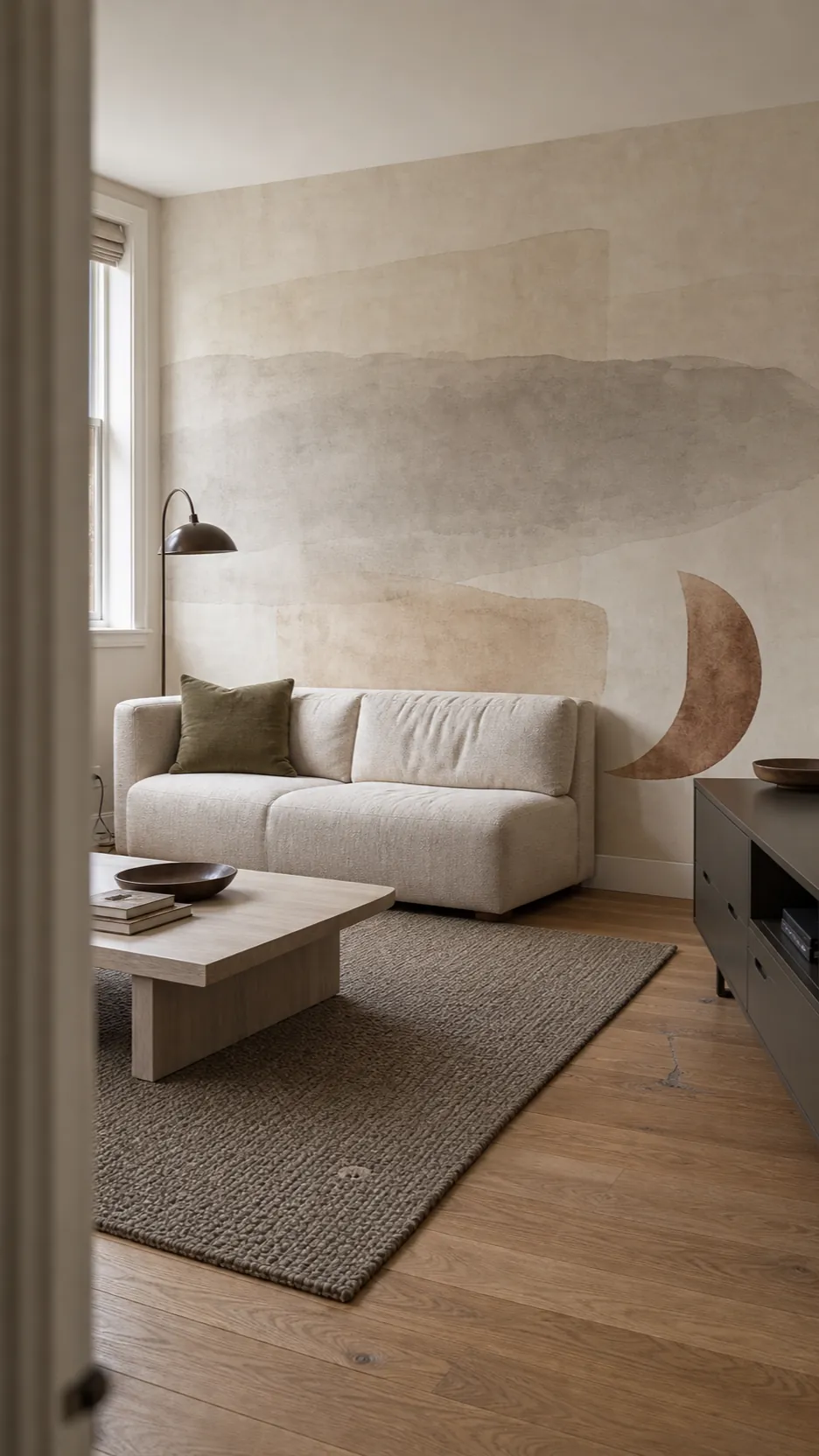

Test the Composition at Wall Scale
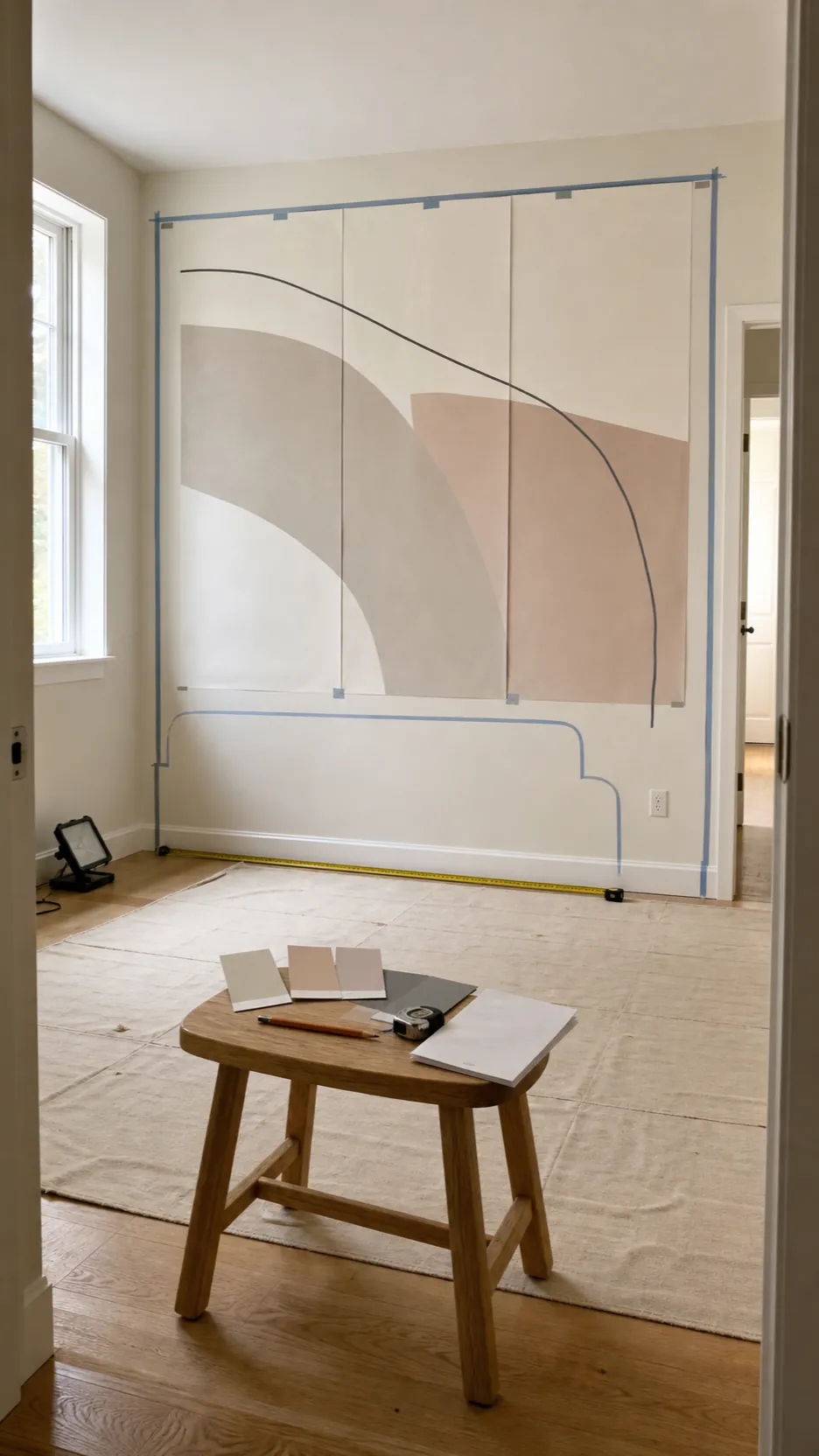
A sample tells you color and material, but not how a full composition behaves. Abstract mural wallpaper living room designs often contain one sweep, block, or line that becomes several feet wide when enlarged. Ask for a room preview or create a simple mockup using a straight-on photograph of your wall. Mark the sofa, lamps, switches, and openings before approving the crop.
Then test the physical sample in at least three places and at different times of day. Beige can turn pink, green, yellow, or gray beside existing paint and flooring. Tape samples flat so shadows do not distort the result, and look from the doorway as well as close up. The mural has to work at the distance from which the room is actually entered.

Choose Movement That Matches the Room
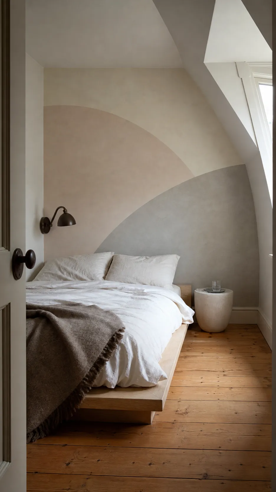
Curves, broad washes, and cloudy transitions feel slower because the eye does not encounter many hard stops. Thin intersecting lines and repeated angular blocks create more energy even when every color is beige. In a bedroom, broad low-contrast arcs or a diffuse mineral wash can support rest. In a dining room or home office, a firmer line can bring useful definition.
Also notice direction. A strong diagonal can make a wall feel active; a low horizontal shape can widen it; a vertical stroke can lift a low ceiling. Choose movement for the architecture you have, not because the close-up image looks attractive on a product page.

Match Undertones, Then Add One Counterpoint
Start with the fixed materials you cannot easily change: floor, stone, cabinetry, and large upholstery. A warm beige abstract mural sits comfortably with honey oak, cream stone, and rust-toned tile. A cooler greige design may suit concrete, black metal, gray oak, and blue-based whites. Mixing undertones can work, but accidental near-matches often make one surface look dirty.
Once the base connects, add one counterpoint. Olive, ink blue, oxblood, black, or dark wood can sharpen a room full of pale neutrals. Use it once or twice, not everywhere. A quiet mural needs contrast somewhere, or every edge loses definition.

Let Texture Replace Extra Color
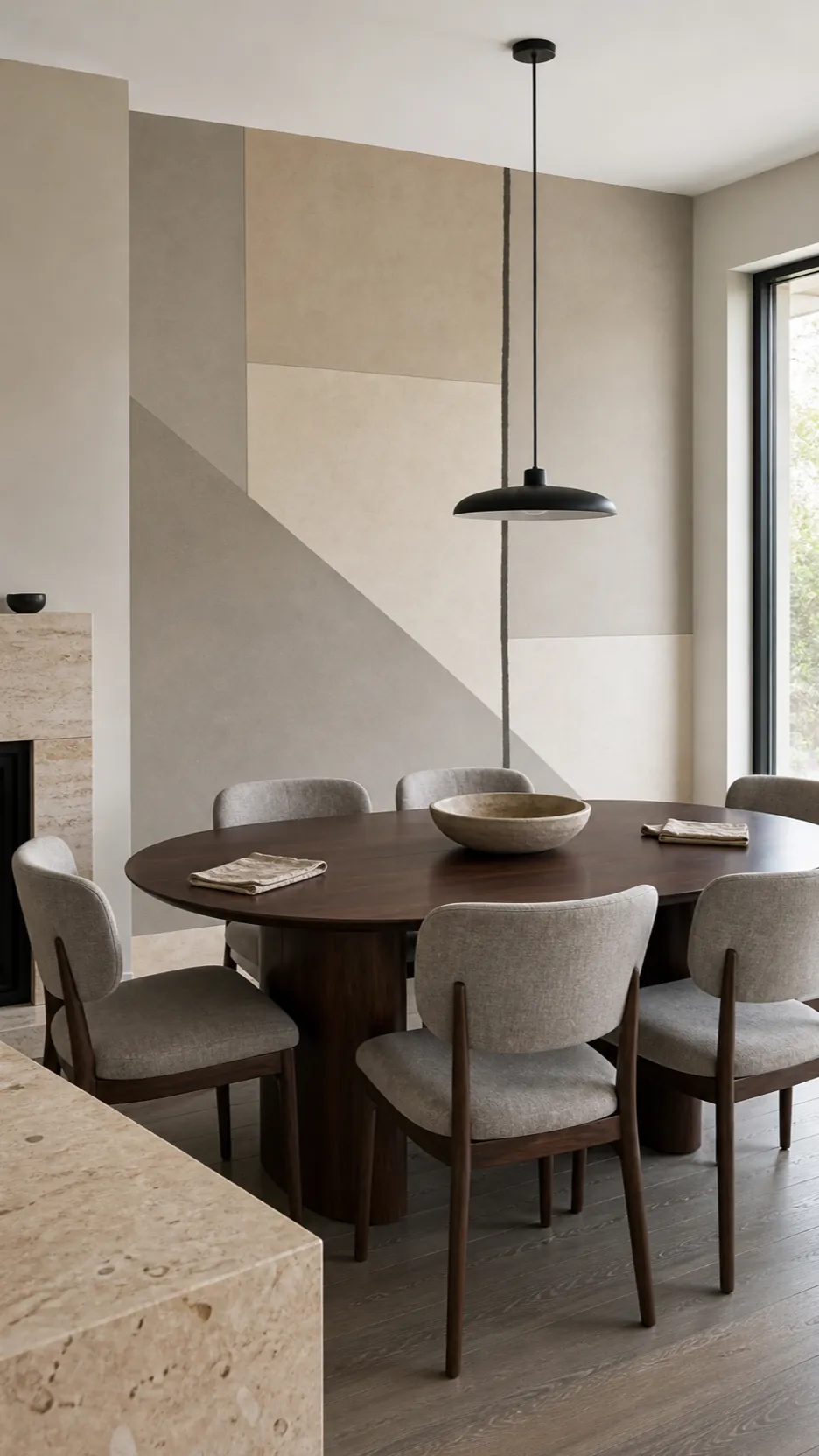
A minimal wallpaper mural stays interesting when its surfaces have distinct character. Pair matte printed paper with nubby wool, open-grain wood, honed stone, washed linen, brushed metal, or hand-thrown pottery. These materials change with light and distance, giving a neutral room depth without adding another color story.
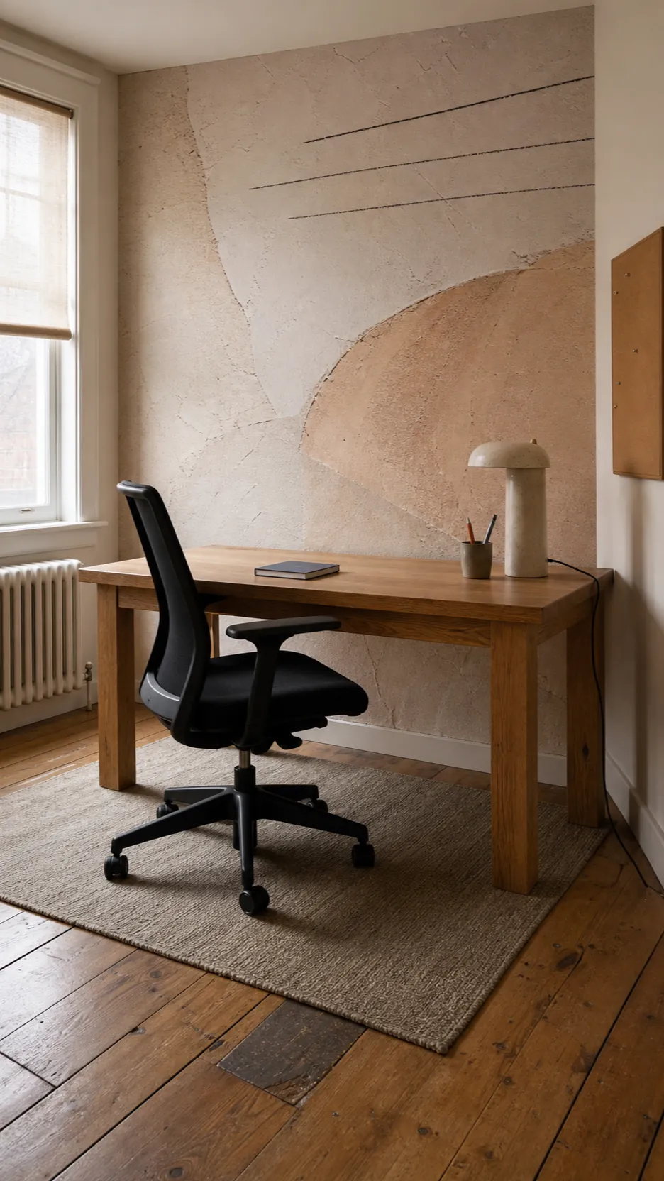
Do not confuse more texture with more objects. One substantial wool rug has more visual authority than five small woven baskets. One oak desk can bring more warmth than a shelf of beige accessories. In a neutral room, scale and material honesty matter more than quantity.

Use Quiet Murals Where Paint Feels Flat
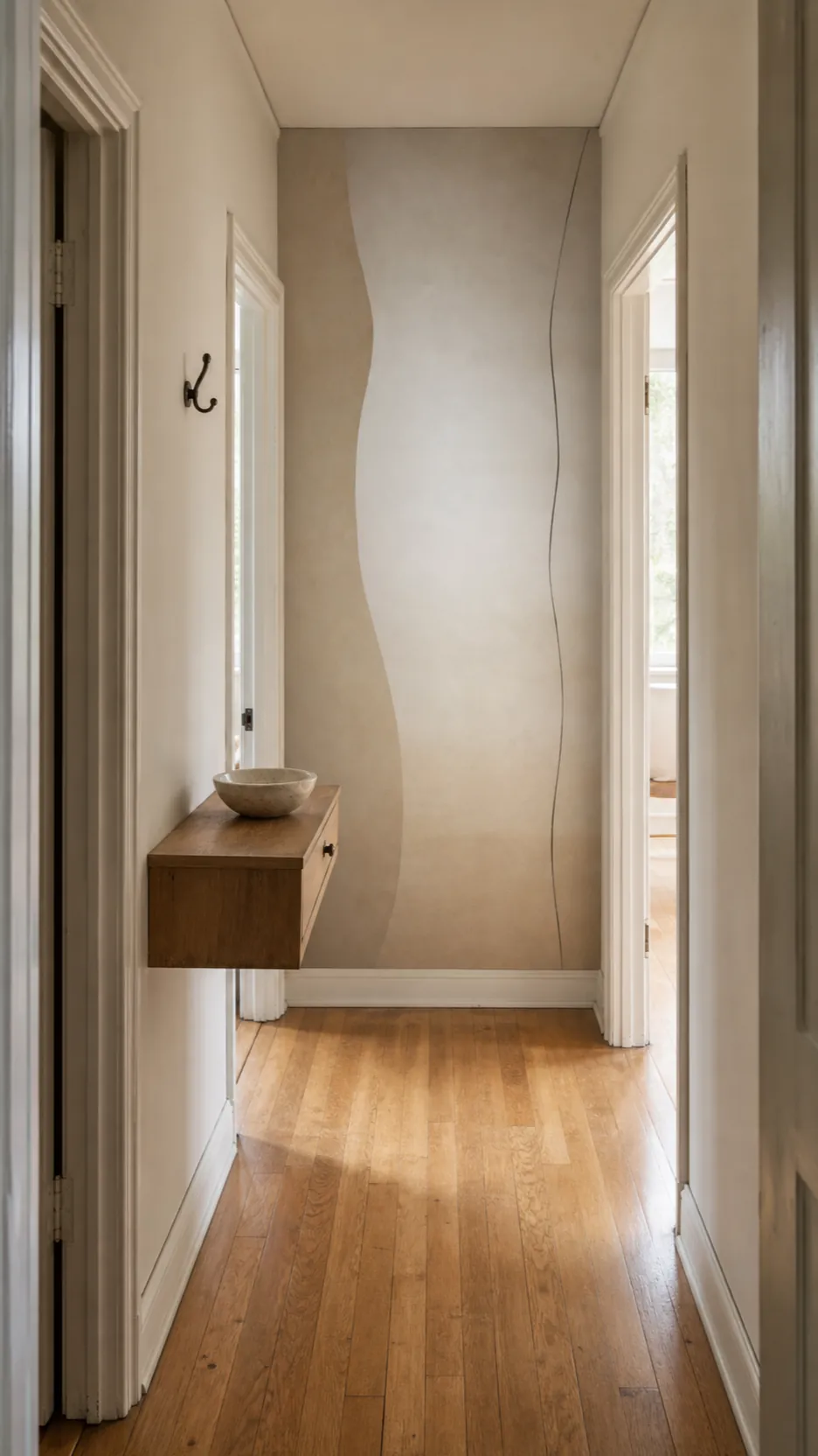
A low contrast wall mural is especially useful where a solid color leaves the architecture unresolved: the end of a long hallway, behind a bed with no headboard, around a shallow dining alcove, or on a living-room wall without a fireplace. The mural can create a focal point without introducing a literal landscape or a repeating motif.
In a narrow passage, choose a design with a pale center or gradual vertical transition rather than dark blocks at both edges. In a small room, fewer oversized forms usually feel calmer than many tiny marks. A large abstract gesture can read as atmosphere; a field of small gestures reads as pattern.

Make the Commitment Reversible
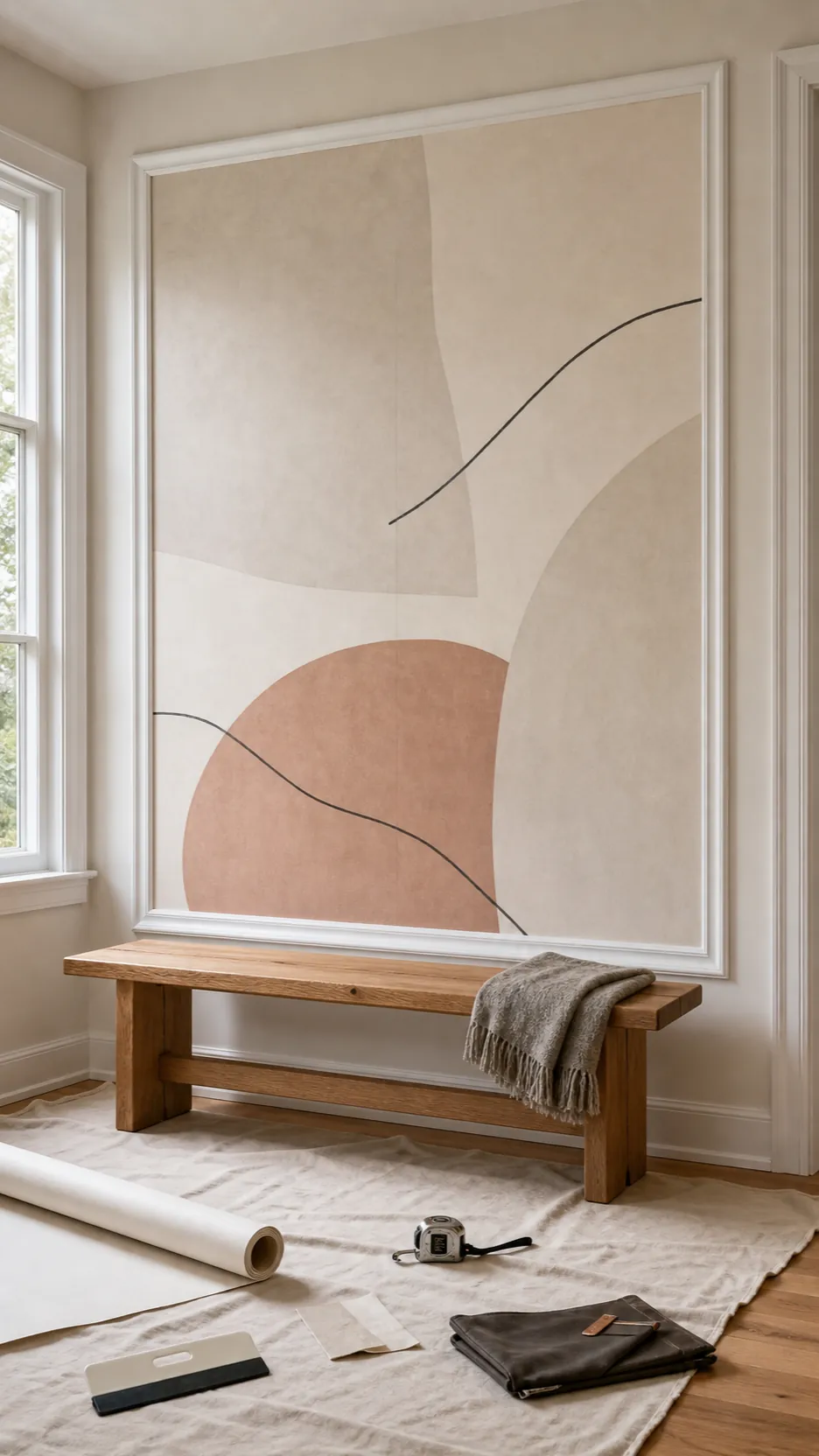
If fear of commitment is the real obstacle, solve that directly. Choose a peel-and-stick material approved for your wall finish, use the mural inside removable panel molding, or start on a wall with simple edges and no difficult corners. Read the manufacturer’s surface, curing-time, and removal guidance before ordering; removable does not mean compatible with every paint or textured wall.
Prepare the surface as carefully as you would for permanent wallpaper. Clean, smooth, dry walls give even a temporary installation a better chance of sitting flat. Keep the order information and one trimmed sample for future color matching. Confidence rarely comes from choosing the faintest possible design. It comes from knowing the composition fits and the installation plan is sound.

The safest neutral mural is not the one you can barely see. It is the one whose contrast, scale, direction, and undertone you have tested in your own room. Choose a composition with enough structure to hold the wall, then let real materials and one deliberate counterpoint do the rest.