Green Wall Papering Ideas for a Living Room That Feels Balanced
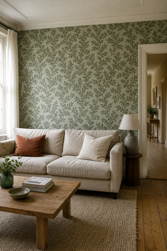
Green wallpaper can make a living room feel calm, enveloping, crisp, or wonderfully theatrical. The difference is rarely the shade alone. It comes from the relationship between pattern scale, daylight, furniture, and the amount of wall you cover. That is why a beautiful sample can look flat at home—and why a bold print can feel surprisingly restful once the whole room is balanced.
If you are collecting green wall papering ideas for a living room, begin with the room you actually have rather than a style label. Notice where the daylight enters, which large furnishings must stay, and how the room connects to the hall or dining area. Those facts will narrow the choices faster than scrolling through hundreds of patterns.
Start With the Green Your Daylight Can Support
Pin a large wallpaper sample to the wall and look at it in the morning, afternoon, and after dark. Cool, indirect light can make blue-based eucalyptus and pine greens appear grayer. Strong warm light brings out yellow in olive, moss, and fern tones. A paper that feels fresh at noon may become dense beside a warm lamp at night.
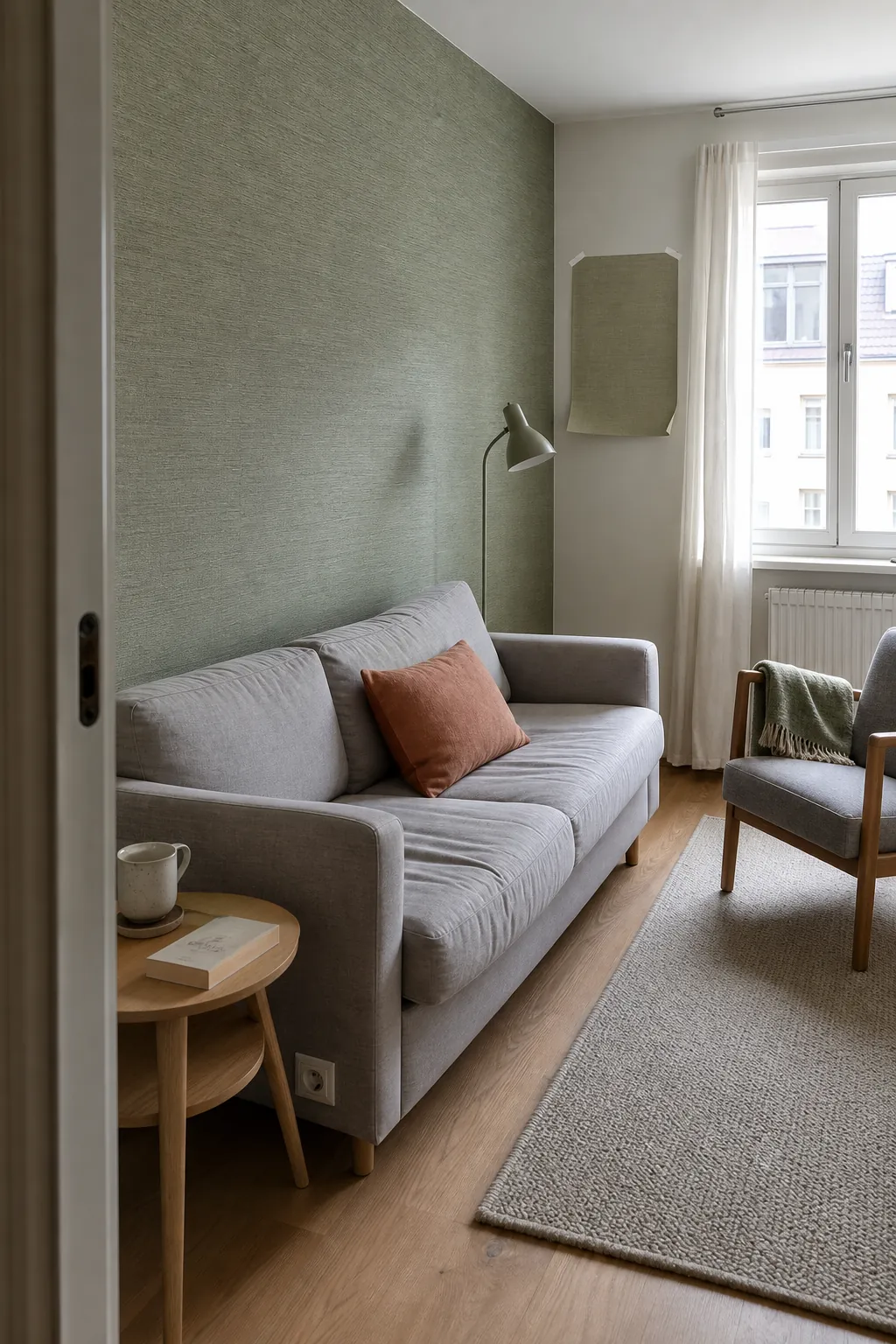

For a darker north-facing lounge, do not automatically reach for the palest green. A weak pastel can turn chilly and washed out. A mid-tone sage with a warm cream ground, or a deep forest design with low color contrast, often has more presence. In a sunlit room, dusty greens resist glare better than highly saturated emerald. Judge the sample beside the sofa, floor, and curtains, not against an empty white wall.
Let Pattern Scale Match the Wall, Not the Floor Plan
A small living room does not always need a tiny print. On a broad, uninterrupted wall, a large botanical or loose geometric repeat can look clearer and calmer than a tight motif repeated dozens of times. Small patterns tend to read as texture from across the room; oversized motifs behave more like a composition.
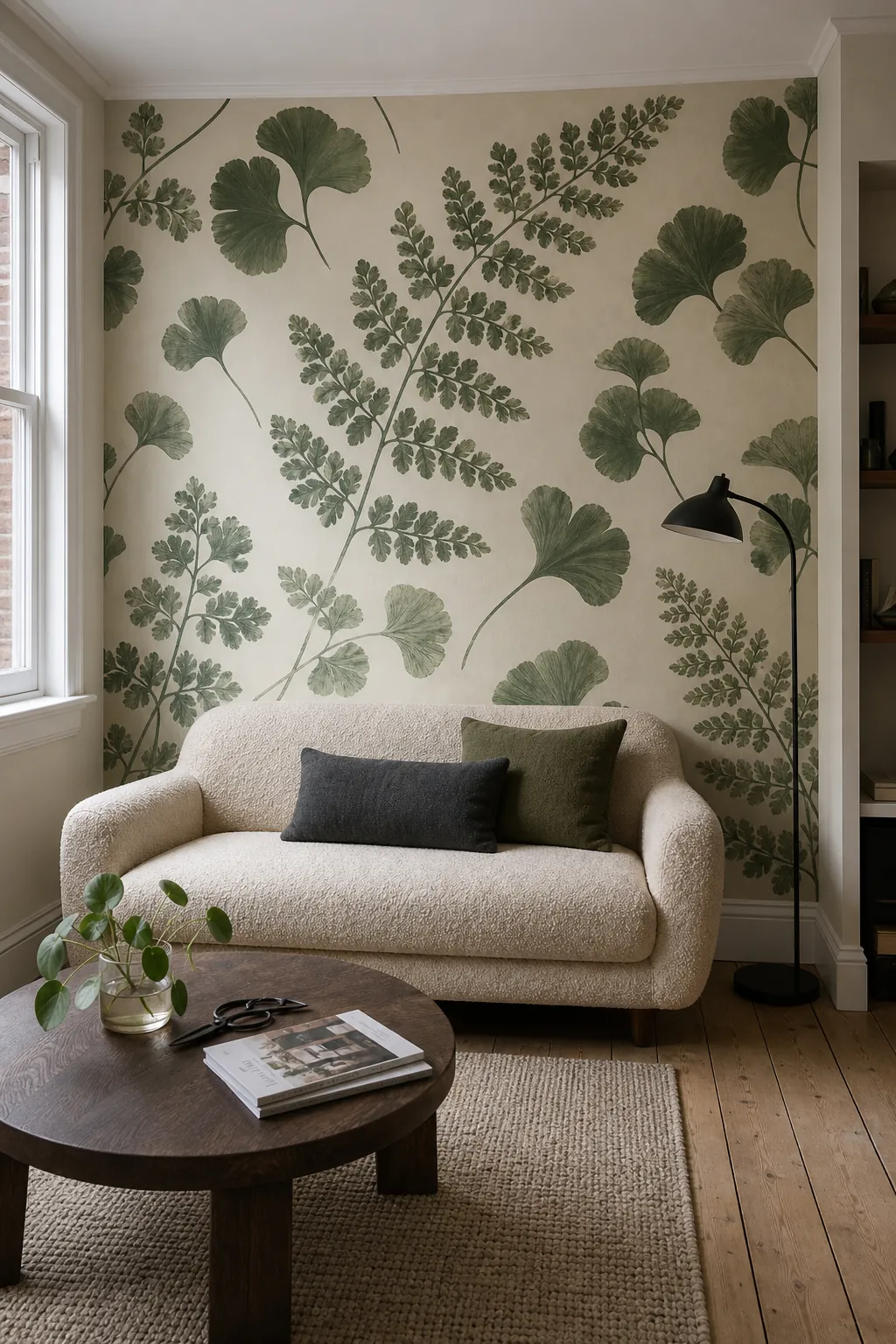

Stand at the room’s normal entry point and consider how many full repeats will be visible. If shelving, windows, and a television break up most of the wall, an intricate pattern may become fragmented. Use a quieter texture there and save the expressive paper for the cleanest wall. For modern living room wallpaper ideas, broad abstract leaves, softened stripes, and simple block-print shapes give the eye obvious places to rest.
Choose One Wall Only When It Has a Clear Job
A feature wall works when it reinforces the architecture: behind the main sofa, around a centered fireplace, or at the far end of a long lounge. It feels arbitrary when it is simply the wall that was easiest to paper. If the room has several chopped-up walls and no natural focal point, wrapping all four walls in a gentle, low-contrast design can actually feel more coherent.
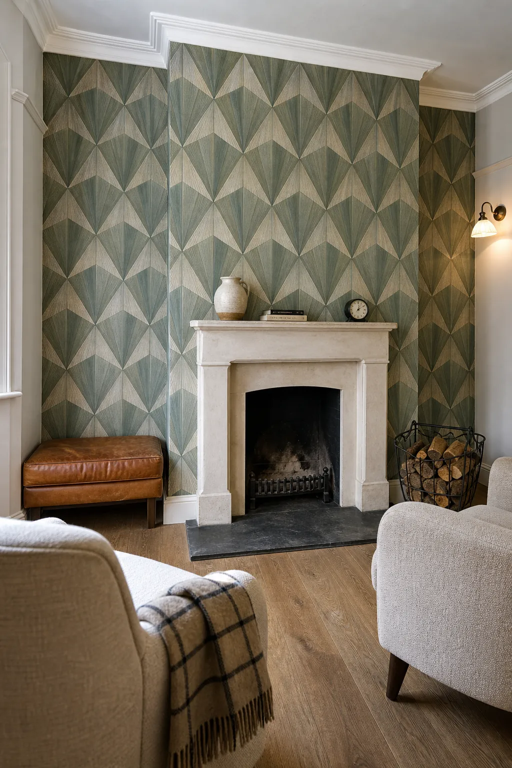

Before committing, take a straight-on photograph of the proposed wall. Doors, vents, switches, and tall furniture are easier to evaluate in a flat image. Ask whether the pattern will still make sense after those interruptions. If not, choose a smaller repeat, a grasscloth effect, or a pattern with no single motif that needs perfect centering.
Build the Palette From Colors Already in the Paper
The easiest way to make a green wallpaper living room look intentional is to repeat two or three of the paper’s quieter colors elsewhere. Pull the background cream into curtains, echo a rust detail in one cushion, or repeat a muted blue in a ceramic lamp. This creates continuity without buying a matching suite.
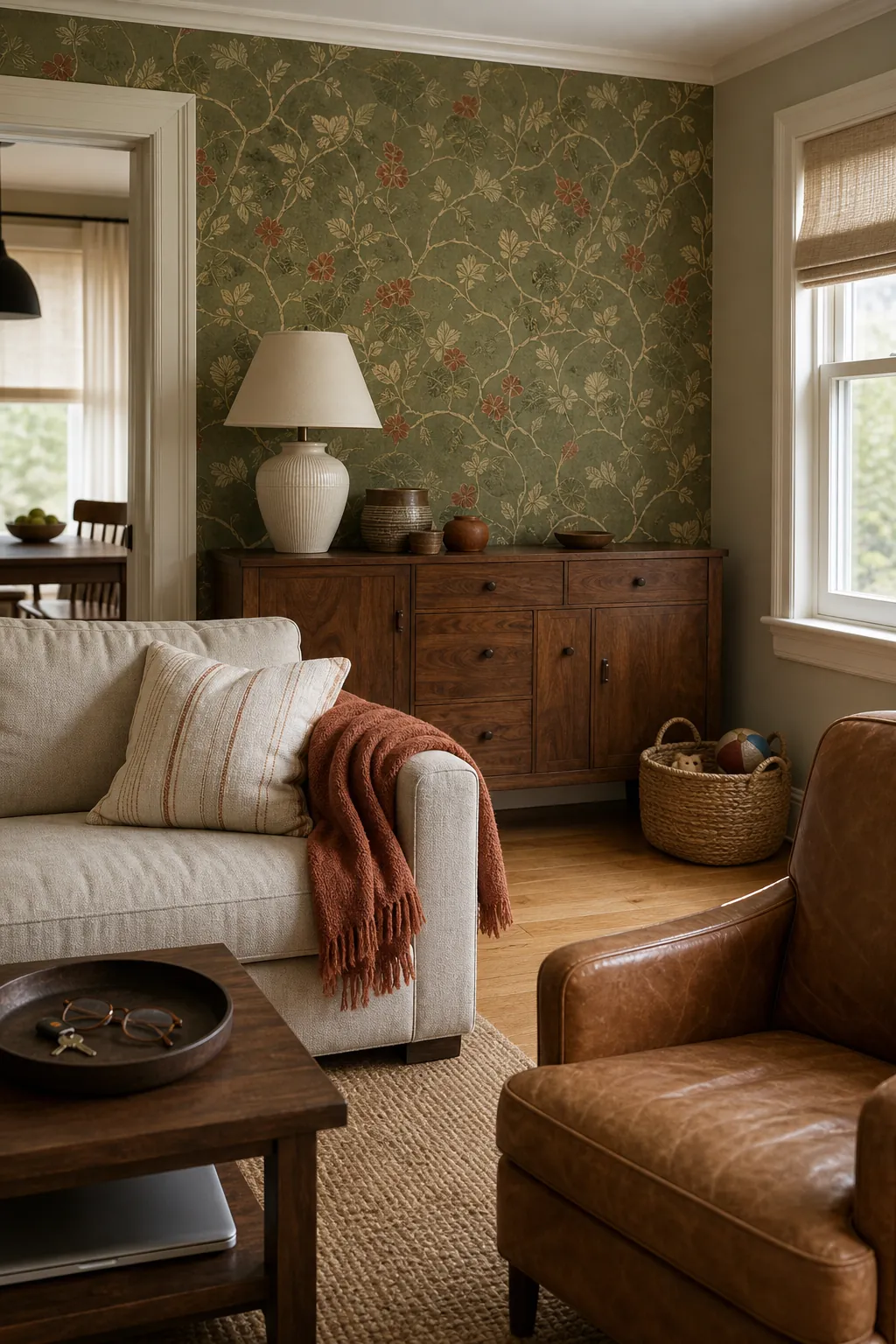

Wood tone matters as much as upholstery color. Pale oak and ash sharpen sage and gray-green papers, which suits a Scandinavian living room. Walnut, smoked oak, and aged brass deepen olive or forest patterns for a moody living room. Farmhouse living room schemes benefit from chalky greens, warm off-whites, worn timber, linen, and a print with hand-drawn irregularity rather than a glossy, hyper-perfect motif.
Give a Moody Room More Than One Kind of Light
Dark green wallpaper is not the problem; a single ceiling light usually is. Deep paper absorbs light and softens corners, so the room needs illumination at several heights. Combine a shaded floor lamp beside the sofa, a small table lamp near the opposite edge, and directional light for shelving or the fireplace. The pools of light reveal the paper gradually instead of flattening it.
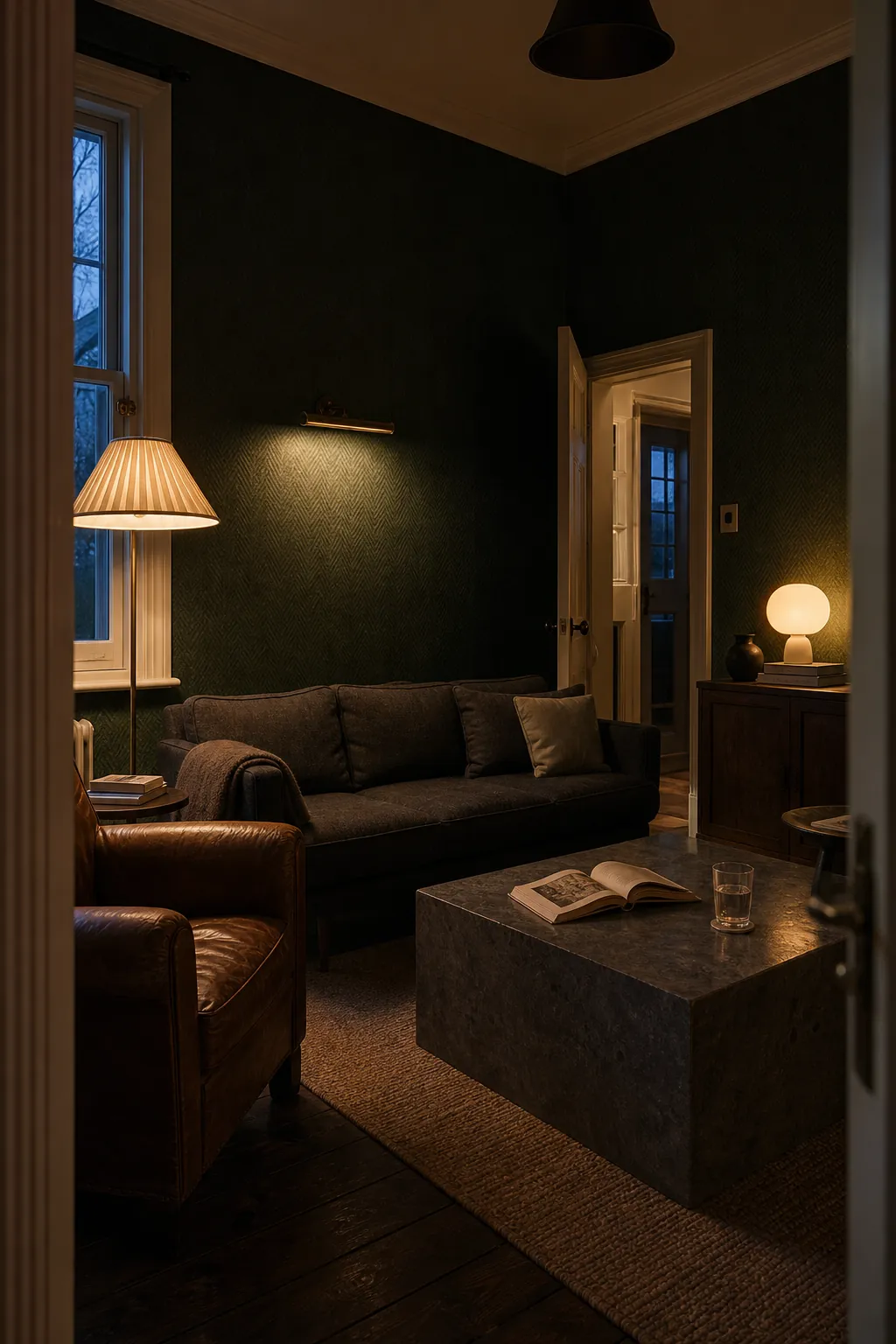

Keep reflective notes restrained but useful: a slim brass lamp stem, glazed pottery, or a mirror positioned to catch daylight. Too many shiny accents can make a nature-led scheme feel themed. Texture does the more important work—bouclé, washed linen, wool, timber grain, and a matte wallpaper finish keep deep green tactile rather than heavy.
Make Adjoining Rooms Feel Related, Not Matched
Open doorways are where many lounge wallpaper ideas lose their confidence. You do not need the next room to repeat the pattern. Carry one undertone through the sightline instead. A warm olive wallpaper might connect to a clay-colored hall; a blue-green print can lead into a soft blue-gray dining space. Repeating the same trim color across both areas is another quiet bridge.
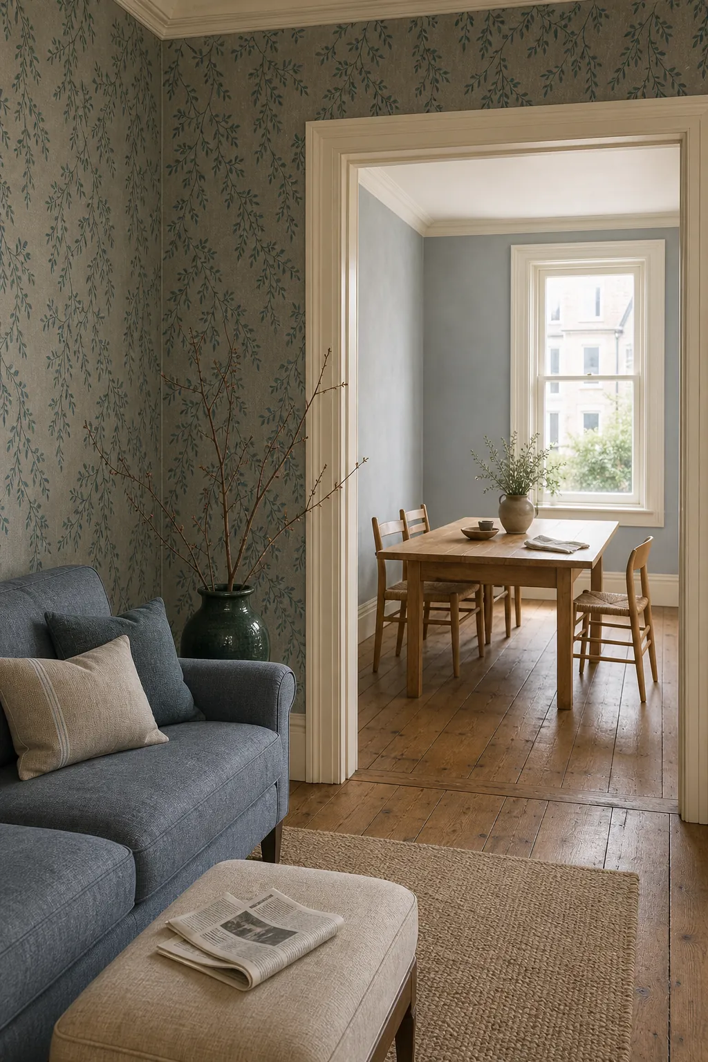

If two visible rooms both use patterns, vary their scale. Pair a broad living-room botanical with a narrow stripe or near-solid texture beyond. Similar colors plus different scales create rhythm; similar colors plus equally busy repeats create competition. This principle is especially helpful when sitting room wallpaper is visible from a hallway or kitchen.
Test the Commitment Before You Order Every Roll
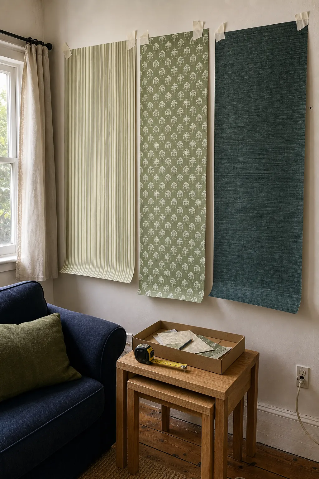

Order the largest sample available and move it around the room for several days. Tape smaller samples together if necessary so you can see at least one full repeat. Check the paper behind the sofa, beside the window, and in the darkest corner. Photograph it at each time of day; the camera makes abrupt undertone clashes easier to spot.
- Measure the full wall area, then account for the manufacturer’s repeat and matching method.
- Confirm that your chosen batch or lot numbers match before hanging.
- Inspect the wall for texture, moisture, cracks, and old adhesive.
- Use peel-and-stick paper for a rental only when the wall finish is compatible and a hidden test removes cleanly.
- Keep an unopened spare roll for repairs, especially in busy family rooms.
The strongest green living room is not the one with the safest sample. It is the one where the paper has a defined role and the rest of the room supports it. Choose a green that survives your light, a scale that suits the visible wall, and two supporting colors you can repeat. Once those decisions are right, bold wallpaper stops feeling risky and starts feeling inevitable.