Tulum Style Wallpaper Murals for Boho Bedrooms & Guest Rooms
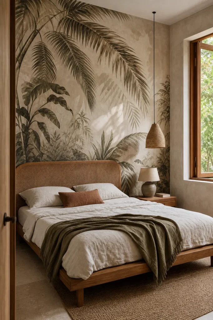
A Tulum-style bedroom is easy to caricature: add palm leaves, rattan, beige bedding, and call it boho. The rooms that actually feel transportive do something quieter. They borrow Tulum’s chalky mineral surfaces, tropical shadow, handmade texture, and indoor-outdoor calm—then leave enough breathing room for those elements to register.
That is why a Tulum style wallpaper mural can be so effective. One wall can establish the atmosphere without turning the room into a themed set. The challenge is choosing a mural with the right subject, scale, finish, and crop, then knowing when to stop decorating. This guide shows how to make that decision for a primary boho bedroom or a guest room that needs to feel memorable but still restful.
Start With the Real Tulum Design Vocabulary
The most convincing Tulum rooms are not built around a palm motif alone. Architectural projects in the region repeatedly use chukum-like plaster, limestone, tropical timber, woven fibers, restrained forms, and filtered jungle light. In one Tulum residential project documented by Interior Design, local stone, chalky chukum finishes, native timber, linen upholstery, and handmade pieces create the character. Candela Tulum’s villas similarly pair Pucté wood, chukum plaster, natural limestone, and a strong connection to the surrounding vegetation.
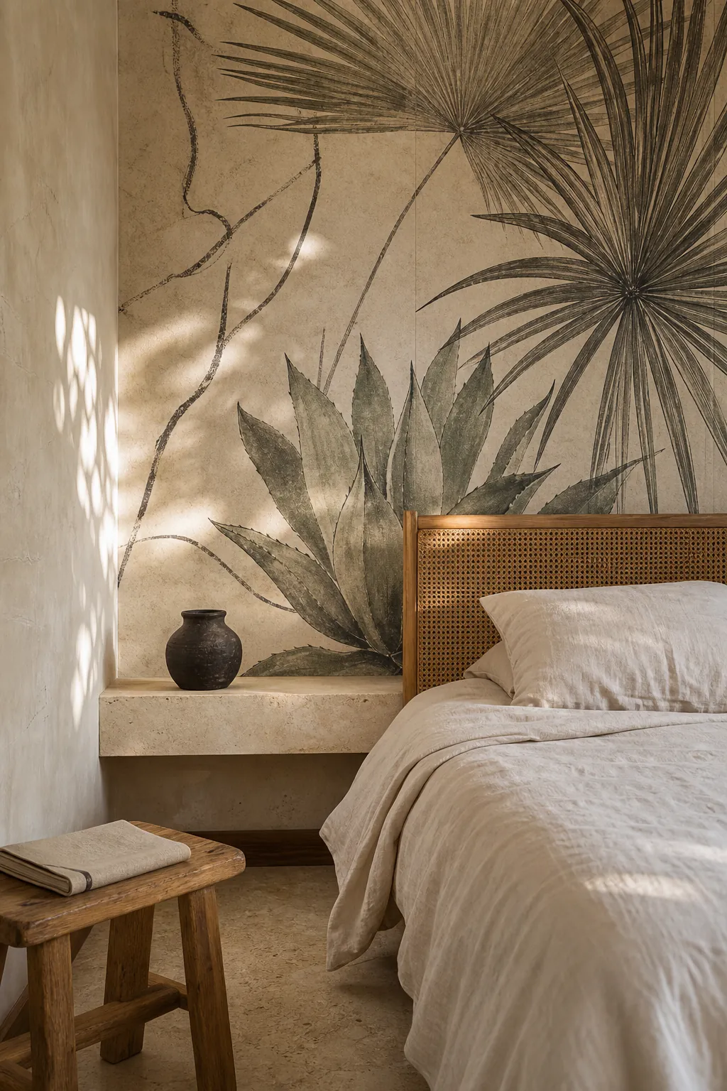

Use that material vocabulary as your filter. A good tulum mural wallpaper might show softened palms, dense foliage dissolving into plaster tones, abstract botanical shadows, weathered arches, or a jungle view with believable depth. It should feel connected to limewash, stone, wood, and fiber—not like a glossy vacation photo enlarged across drywall.
The mural should suggest a place, not advertise a theme. Muted tonal variation usually gives you more freedom than saturated turquoise water, hard black silhouettes, or dozens of equally sharp leaves. If every part of the image demands attention, the wall will compete with sleep, furniture, and real life.
Choose the Crop for the Bed, Not an Empty Wall
Most mural previews show a blank wall. Your wall will have a headboard, nightstands, lamps, pillows, outlets, and perhaps a sloped ceiling. Those objects change the composition. Before ordering, make a quick elevation sketch or tape the bed width and headboard height on a wall photo. Then place the mural preview over that occupied area.
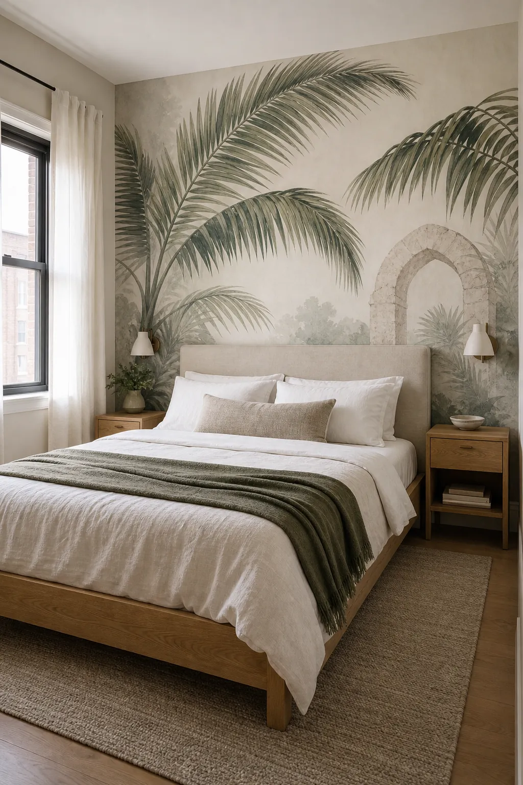

For a mural behind the bed, keep the most expressive foliage, arch, or light opening visible above and beside the headboard. Do not pay for a beautiful focal point that will disappear behind upholstery. A centered composition can make a symmetrical bed arrangement feel intentional, while an off-center palm canopy works well when a window or door already makes the room asymmetrical.
A small bedroom does not automatically need a tiny print. In fact, one or two oversized, softly rendered forms can feel calmer than a dense repeat. What matters is visual contrast and perspective. A gentle layered canopy can create depth; a sharp photographic horizon that lands halfway through the headboard can make the wall look accidentally cropped.
- Measure the wall at more than one point; ceilings and corners are not always perfectly square.
- Mark the headboard, sconces, outlets, and switches on the supplier’s crop preview.
- Ask whether the artwork will be cropped, stretched, mirrored, or extended to fit your dimensions.
- Check the panel layout so a face, palm trunk, or architectural edge does not fall awkwardly on a seam.
Let the Primary Bedroom and Guest Room Behave Differently
A primary bedroom can support a more personal and immersive boho wall mural because you already know your tolerance for color, contrast, and visual detail. You might choose a deeper olive canopy, a shadowy cenote palette, or an enveloping mural that continues onto a second wall. You will also see it daily, so sampling matters even more.
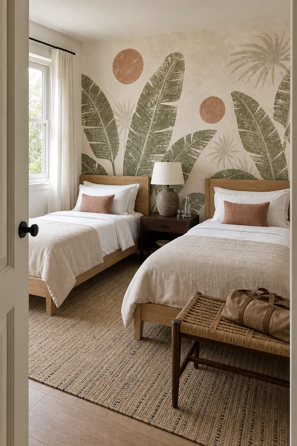

A guest room has a different job. It should have enough identity to feel considered, but it must work for people with different tastes and sleep habits. A guest room mural wallpaper is usually easier to live with when it has a light mineral ground, moderate contrast, and one legible botanical idea. Airy palm shadows, desaturated jungle layers, or a loose block-print botanical can deliver the vacation-bedroom feeling without making visitors feel enclosed.
Test the view from the doorway and from the pillow. The doorway view creates the first impression; the pillow view is what a guest sees while resting. If the mural feels dramatic from the hall but restless from bed, move it behind the headboard or choose a quieter crop. In a multipurpose guest room, keep the mural away from a video-call background if its scale or subject will distract on camera.
Build the Palette From Three Material Colors
Tulum style is often called neutral, but a room made only of beige can look flat. The richer version uses color that appears to come from materials: limestone cream, clay, sun-warmed wood, woven palm, dusty olive, deep leaf green, charcoal, or the muted blue-green of shaded water.
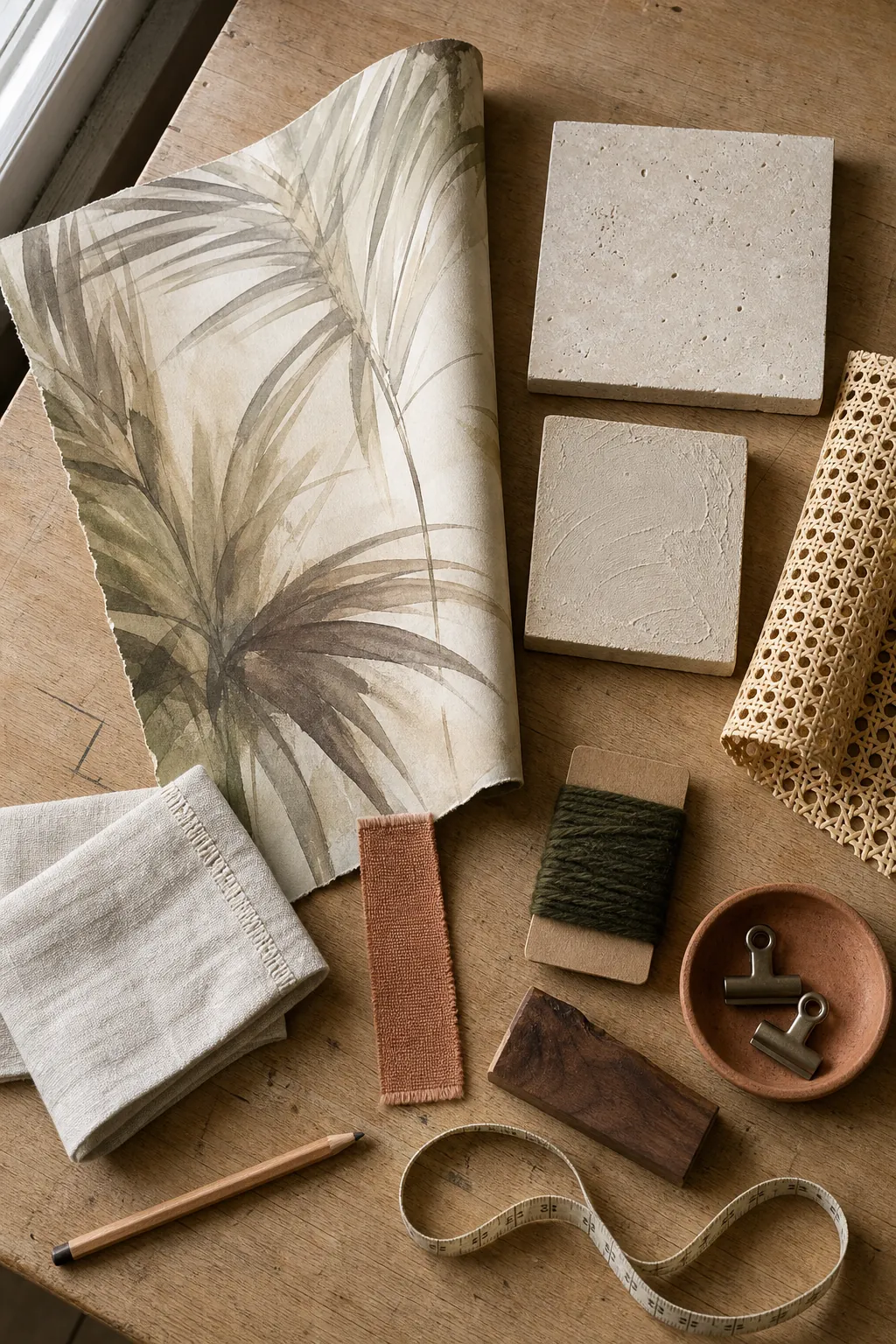

Choose three anchors from the mural:
- A light ground for walls, sheets, or curtains—chalk, sand, mushroom, or warm ivory.
- A natural mid-tone for wood and fiber—honey, tobacco, caramel, or terracotta.
- A dark note for depth—olive, cacao, charcoal, or inky green.
Repeat each anchor once or twice, not everywhere. If the tropical boho wallpaper carries strong green, let bedding remain mostly solid and bring the green back in one lumbar pillow or glazed lamp. If the mural is sandy and nearly monochrome, add contrast through dark wood and a clay-colored throw rather than another pattern.
Always check the mural sample under the room’s actual bulbs. Warm lamps can push cream toward yellow and make green look muddy; cool bulbs can turn a soft mineral background gray. The right sample should still feel intentional in morning light and at bedtime.
Use Texture to Support the Mural, Not Compete With It
Real rooms often go wrong after the mural is chosen. The owner keeps adding macramé, baskets, pampas grass, carved stools, patterned pillows, and plants because each item seems “boho.” The result is a collection of style signals fighting one another.
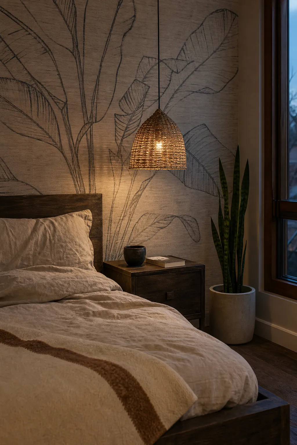

Treat the mural as the room’s pattern and let the other pieces contribute texture. Linen bedding, a timber bench, one woven pendant, a flatweave rug, and a small amount of handmade pottery are usually enough. Choose one dominant woven material rather than mixing cane, bamboo, seagrass, jute, and macramé at equal strength.
Plants are optional, even with a palm tree bedroom mural. A real plant can connect the two-dimensional image to the room, but several large plants may blur the mural’s silhouette and add maintenance your guest room does not need. If you use one, place it where its leaf shape differs from the printed foliage so it reads as a deliberate foreground layer.
Lighting should reveal texture instead of flooding the wall. Warm bedside lamps make plaster tones and wood grain feel tactile; a shaded pendant adds a soft pattern of light. Avoid aiming a harsh spotlight at a slightly reflective mural, because glare can expose seams and flatten dark botanical details.
Sample the Finish and Prepare the Wall Before You Commit
Home decorators discussing murals repeatedly raise the same problems: an image looked soft or glossy in person, peel-and-stick panels grabbed before they were aligned, seams lifted, or a lightly textured wall weakened adhesion. Those are not minor installation details. On a full-height mural, they determine whether the result feels architectural or temporary.

Order a printed sample at the intended scale, not just a tiny color chip. Place it high, low, and beside the bed for several days. Look for crisp detail where it should be crisp, believable softness where the art calls for it, a low-glare surface, and colors that relate to your flooring and furniture. If the print already looks synthetic as a sample, styling will not rescue it.
Choose the material for the wall and your time horizon. Peel-and-stick can suit a smooth, properly painted wall and a temporary design, but it is not automatically the easiest format for a large mural; the adhesive can make repositioning unforgiving. Paste-the-wall and traditional materials generally allow more movement while aligning panels, though removal and installation requirements differ. Renters should get permission and test the exact product in an inconspicuous area.
- Repair holes and flaking paint, then sand raised patches smooth.
- Make sure the wall is clean, fully dry, and compatible with the mural manufacturer’s adhesive.
- Prime or seal new or porous surfaces as the product instructions require.
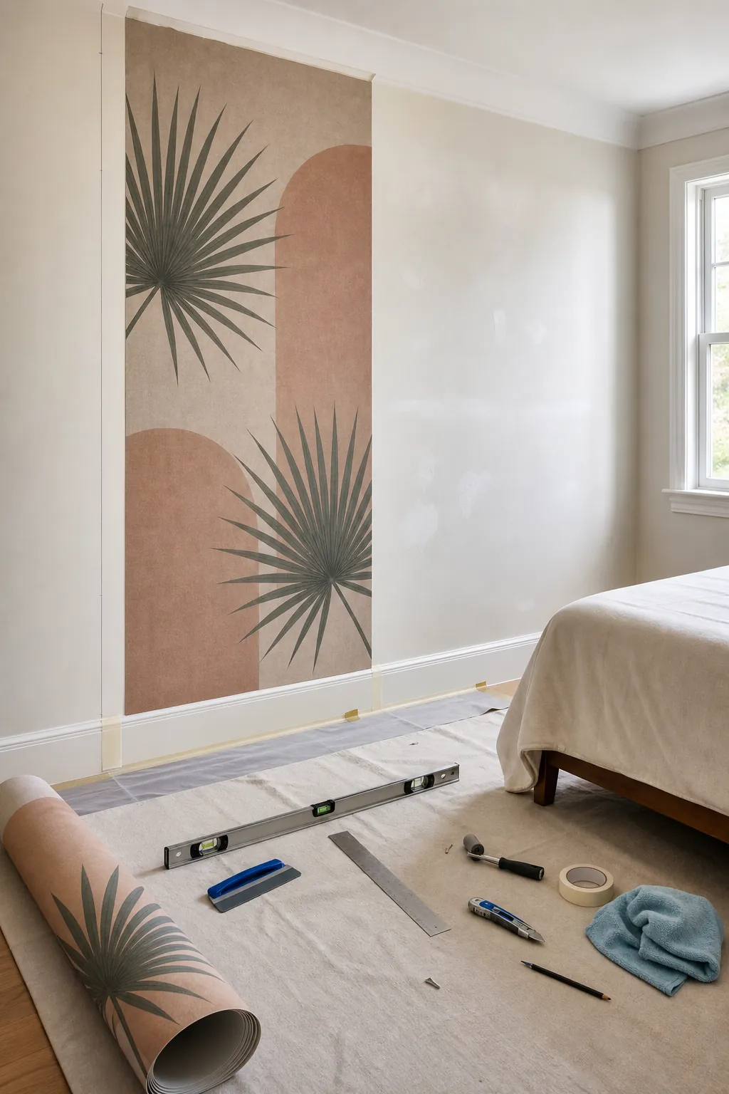
- Use a level or plumb line for the first panel; do not trust the corner to be straight.
- Dry-check panel order and image continuity before exposing adhesive or applying paste.
- Use sharp blades for edge trimming and follow the manufacturer’s overlap or butt-seam method exactly.
The finished room should feel good after the styled photos are over—when a suitcase sits on the bench, the bedside lamps are on, and someone actually needs to sleep there. Choose a tulum style wallpaper mural that carries the atmosphere on its own, give it a few honest materials for company, and leave the rest of the room quiet.