6 Plaid Wallpaper Ideas That Feel Tailored, Not Themed
Plaid wallpaper has a reputation for making rooms feel either wonderfully tailored or instantly themed. The difference is rarely the pattern alone. Scale, contrast, lighting, and the other textures in the room decide whether a plaid wall reads as architecture, fabric, or visual noise. The safest approach is not always the smallest or palest plaid; it is the one with a clear role.
Before ordering, view a large sample on every wall you plan to cover, morning and night. Check the repeat and match type, confirm every roll comes from the same run, and calculate extra material for pattern matching. Plaid exposes a wall that is not plumb, so establish a true vertical line rather than trusting the nearest corner. These six rooms show how different plaid textures and palettes can work without turning the whole home into a cabin.
A Soft Windowpane Plaid for a Calm Bedroom
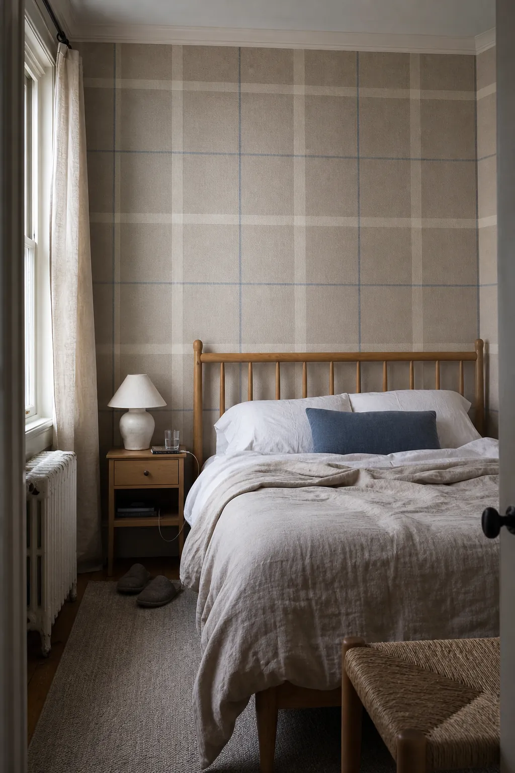
A large windowpane plaid in oatmeal, warm white, and a thin blue-gray line gives a bedroom structure without crowding it. The generous checks behave almost like wall paneling: they make the headboard feel anchored and help a low ceiling look orderly. Because the contrast is restrained, the pattern can wrap all four walls more comfortably than a dark tartan.
Keep bedding mostly solid and vary texture instead—washed linen, wool, and cotton rather than another strong print. If you add a rug, choose an irregular or small-scale motif so it does not create a second competing grid. Pull the thinnest wallpaper line into one cushion or lamp base and let the rest remain relaxed.

A Deep Tartan Plaid for a Dining Room
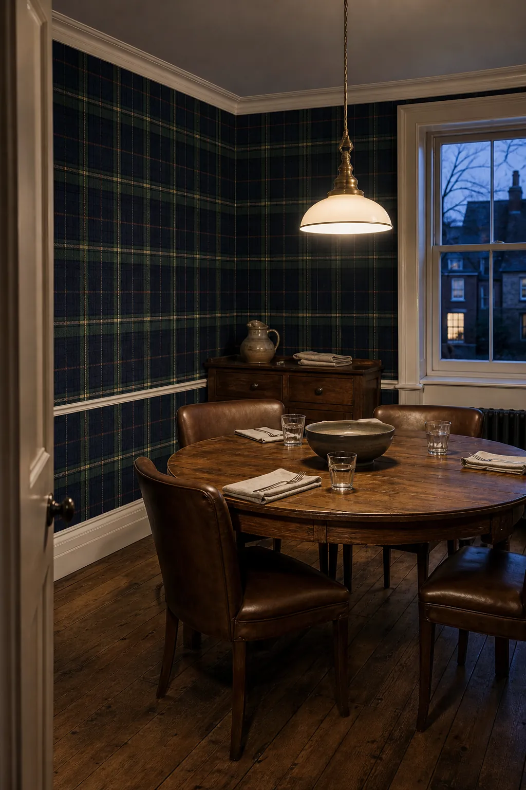
A dining room can carry a richer plaid print because it is experienced for focused periods, often under warm evening light. Choose a tartan with one dominant dark tone—ink, forest, or oxblood—and two quieter crossing colors. That hierarchy keeps the wall from becoming a checkerboard of equal-strength lines.
Round tables and curved chair backs are useful against all those straight lines, while aged wood and unlacquered brass add depth without another pattern. Test the sample beside the actual light fixture: warm bulbs can muddy green or exaggerate red. Let the wallpaper be the room’s major pattern and make the remaining surfaces support it.

A Pastel Gingham Plaid in a Nursery
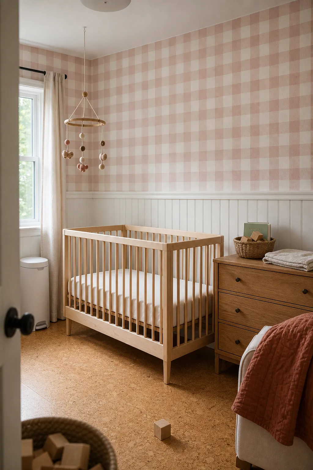
Gingham is technically simple, but its softness depends on scale. A medium check in dusty blush and cream feels fresher than tiny picnic cloth squares, especially behind a natural wood crib. For a calmer result, paper the upper wall and add painted wainscoting below; the solid lower section absorbs the visual repetition and handles scuffs more easily.
Skip heavily themed accessories. A plain mobile, one block-print quilt, and practical baskets are enough. If the room already has a Persian-style rug or another complex pattern, compare them from across the room: shared colors can connect two patterns, but similar scale often makes them fight.

A Bold Buffalo Check for a Basement Lounge
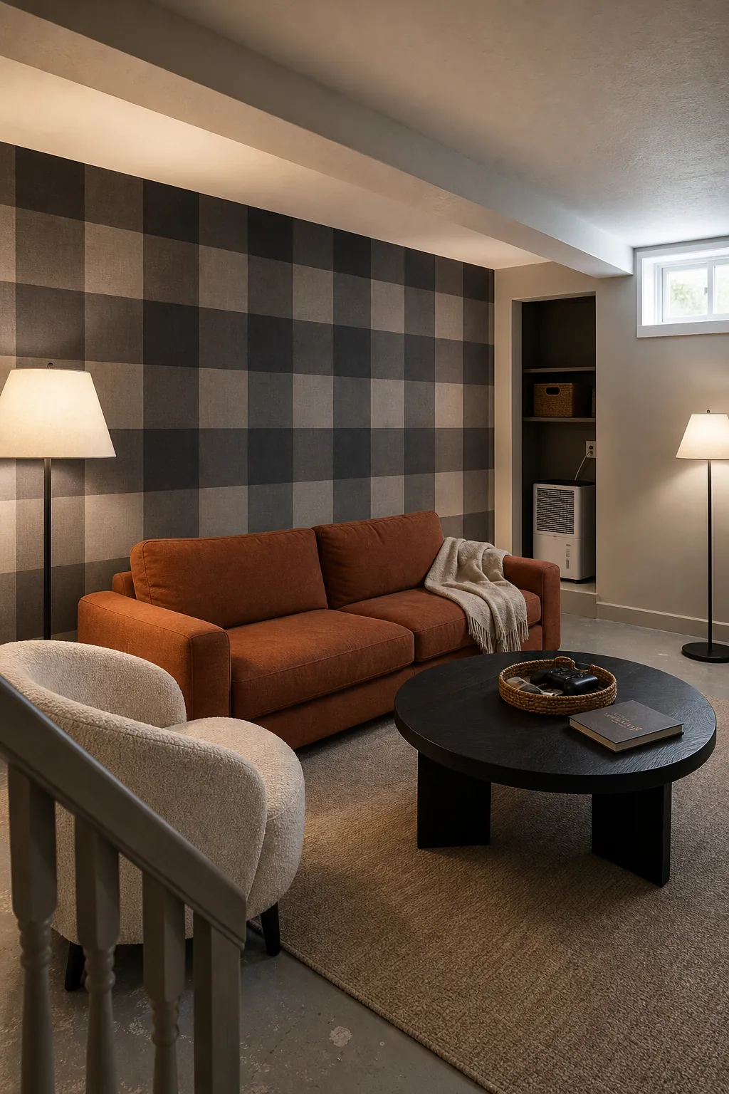
Basement wallpaper can handle a graphic buffalo check when the room has enough uninterrupted wall for the repeat to read clearly. Instead of black and white, try charcoal and mushroom or navy and denim. The softened contrast still creates impact but is kinder under limited natural light.
Use it on the wall with the fewest doors, soffits, and vents; large checks become awkward when constantly chopped. Balance the geometry with a low solid sofa, a round coffee table, and broad pools of lamp light. Check that the basement is dry and the wall suitable for the selected product before installation—wallpaper is not a cure for moisture.

A Fine Tailored Plaid for a Home Office
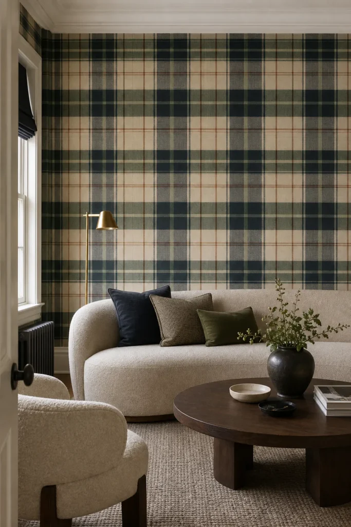
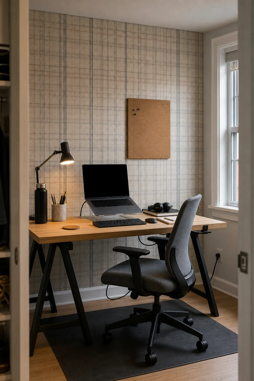
A fine plaid in graphite, parchment, and muted rust can make a small office feel precise rather than rustic. Look for irregular line weight or a woven-looking ground so the repeat does not resemble spreadsheet cells on camera. Position the desk before choosing the starting point; a strong vertical stripe directly behind the chair can look oddly centered during video calls.
Keep shelving simple and allow some wallpaper to remain visible. Matte black metal, pale oak, and one leather desk accessory add enough material contrast. Avoid stacking plaid curtains, a checked chair, and gridded storage in the same view. The pattern should organize the background, not multiply across every object.

A Watercolor Plaid for a Small Powder Room
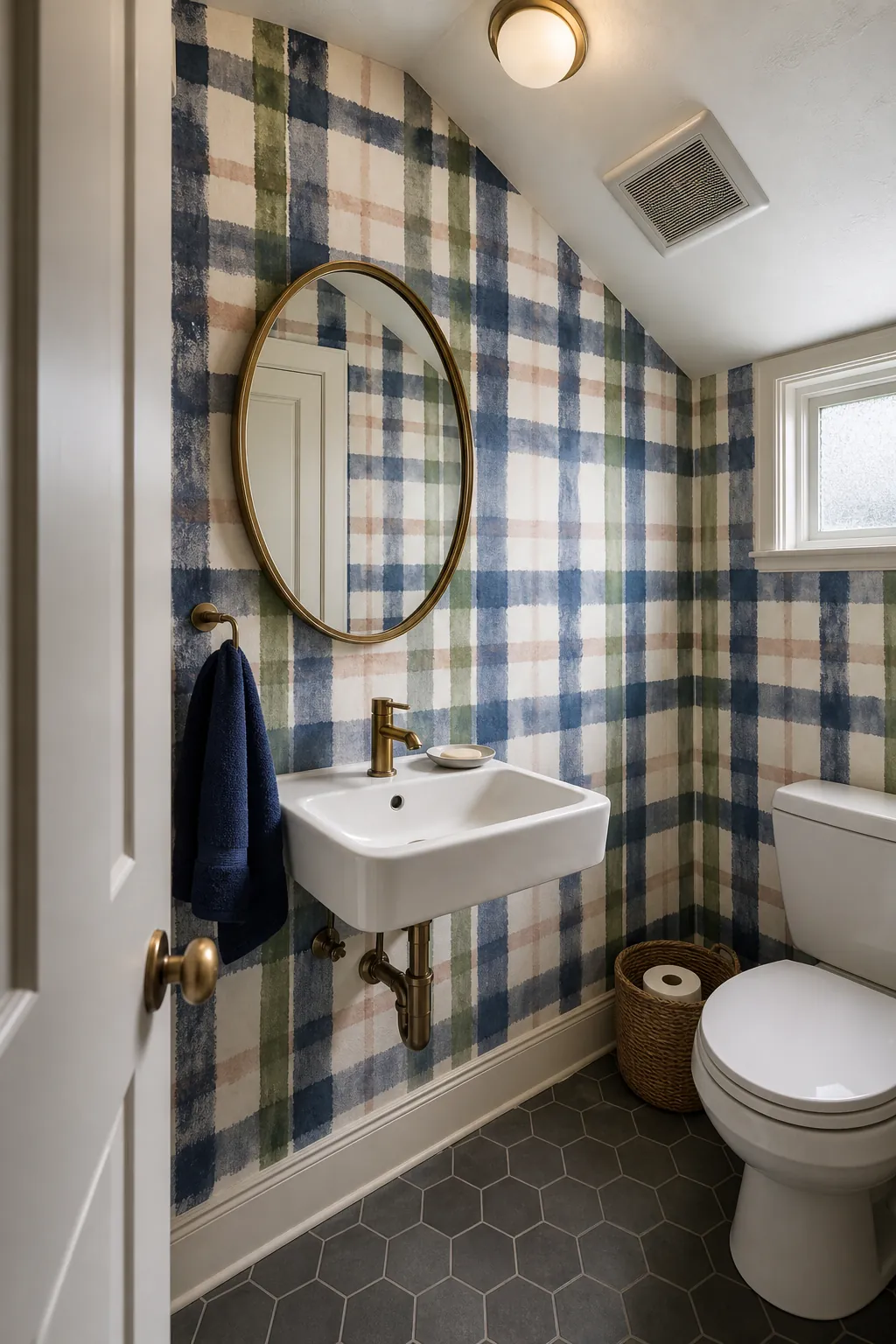
For a powder room, a loose watercolor plaid delivers color without the stiffness of perfectly registered lines. Uneven indigo, moss, and pale clay strokes feel handmade, while the small room gives the pattern a complete envelope. A simple mirror interrupts the repeat more gracefully than a gallery of small frames.
Confirm the wallcovering, adhesive, and ventilation are appropriate for the room; removable papers can react poorly to repeated humidity swings. Hang the first few strips under lighting close to the room’s final conditions, then stop and inspect the match, color, and seams before continuing. Plaid rewards patience because every crossing line reveals alignment—good and bad—immediately.